The only interior picture I took of the concert that wasn't blurry.
Last Tuesday we went out on the town (not the town I live in since there isn’t much town to out upon) and saw Neko Case in concert. It took place at the lovely Meymandhi Concert Hall in Raleigh, NC. If you don’t know who Ms. Case is you might recognize her as part of the Canadian band The New Pornographers. In her solo work she veers away from the harder rock sound of that band and instead ranges from honky tonk and country-rock to haunting ballads. In general she’s hard to categorize as a solo artist but is well known for her powerful and lovely voice. When it was announced she was touring in support of her new album Middle Cyclone and a show was to be relatively nearby we made sure to grab some tickets.
Outside Meymandhi Concert Hall.
Getting there is not half the fun when you have to drive two hours. Still we had additional motivation for the trek in the form of dinner at the Raleigh Mellow Mushroom location. After overeating and visiting a high end chocolate shop across the street (yay for dark chocolate with chili cream filling) we headed over to the concert. The last time we were there we saw The Swell Season fresh off of winning the Oscar for best song in the movie Once. What was great about both times was ease of parking. You have to love a place where you don’t have to pay too much to literally park across the street.
It’s a classy venue (probably too classy for me!) and the lobby had several bars set up with top-shelf liquors and beers plus big honkin’ cookies for purchase. We beelined over to the T-shirt area so I could pick up the mandatory concert garb.
Mr. Puggy, get out of the way of the shot!Front of Neko Case concert shirt.Back of shirt being examined by Snuffy.
When seated we found the opening act was not really to our liking so we twiddled our thumbs until the main event. Neko made up for that disappointment with a great voice and fantastic set of old and new songs. I was happy to hear cuts from her previous album, Fox Confessor Brings the Flood, which is a favorite of mine. On the down side we had a drunken hooting woman behind us with the amazing gift of projecting her voice with the force of an air horn. After professing her love for Neko several times she went into request mode loudly wishing the song “Prison Girls” be sung immediately since it “kicked ass”. The backup singer on stage had the job of being snarkstress to people like this who yelled by throwing out quips like: “Oh! Let me make a note of that (mimes pen and pad); Raleigh, 4/7/09, ‘You’re awesome’. Got it.”
Even newer pens can quickly need some tender loving care. Recently some simple repair work came up on a pen that shouldn’t have needed it. It was purchased used but promised to be in working condition which, as you can guess, was not an accurate description. Still, I’m happy I did get to do this work since it’s an interesting pen with a bit of a story.
Several years ago Richard Binder, well known for his specialty nib work, and Filcao, a little known Italian pen manufacturer, collaborated on a design. Called “Columbia, the Gem of the Ocean” it is styled in the mold of a vintage writing instrument. CTGOTO (I love acronyms) has solid, square shouldered good looks and a moderately large size which makes it comfortable to use. The luxury of a sterling silver cap band is a contrast to the humble steel Schmidt nib. But it is not a simple nib since Mr. Binder has in this case tweaked it to be a cursive italic. Orange flecked blue acrylic used for the barrel and cap is the finishing touch to this attractive ensemble.
Worth noting here is something not seen too often on modern pens: a button filler. With the original Duofold Parker put this filling method on the map as a way around patents like Sheaffer’s for the lever filler. It is novel, quaint, and best of all works easily in the following manner: A button under the blind cap at the end of the barrel is pushed down to start the process. This button rests on one end of a spring steel pressure bar and the other side is anchored in the niche between the sac nipple and the inside wall of the barrel. This unit will flex with the downward pressure compressing the sac that it sits next to. When the button is release the sac inflates which draws the ink into it.
When this pen came to me I was surprised to find that the rubber sac had hardened and broke. Usually you wouldn’t think that could happen on a pen this new, but it did. My guess is that the sac may have been old stock and had aged even before it was used. Either way, it was an inky mess inside when disassembled. To fix it all that was needed was a scrubbing and a new sac. A silicone sac was used since I like the fact they don’t degrade like rubber ones over time. Below are a few pictures of the process.
Filcao dissasembled for repair. (Click for larger image with parts labeled)
This is the pen taken apart for the repair. Not really very many parts for this filling system.
Button filler.
The pressure bar sits next to the sac like shown here. The button at the end forces it to flex.
Filcao pressure bar being inserted.
After section with sac screws into the barrel you insert the pressure bar from the other end until I seats near the section.
You can see the end of the bar peeking out. Next the button and retaining washer is screwed onto the end.
I have a weakness for Sheaffer Snorkels and I’ve already talked a bit about one in an earlier post. They were from that writing era between fountain pens with expressive nibs and the evil empire of the ball point pen. The precise lines of nail like fine and medium point pens were the hallmark of this period. Even if most people were happy with this dull situation Sheaffer still offered a wide variety of Snorkel nibs with flair. Those special order nibs, as well as some made in Canada, England, and Australia which catered to those markets less uniform tastes, offer a real treat for the collector today.
Determining if you have found an oddball nib is by the numbers. Well, actually numbers and letters since Snorkel nibs were marked on the front or back with a code. I’m not going to discuss Sheaffer’s elaborate numbering system for their Snorkel fountain pen nibs since places like PenHero.com have great articles on the subject. What I’m going to do here is show my interesting nibs so you can see a few examples and in later posts some will get a more thorough review.
In this picture: Australian bold flex, FF3 fine flex, FS2 stub flex, Australian bold triumph, SR4 right oblique triumph, s4 stub. (click on for larger image)
If you want to find one of these great nibs keeping your eyes open is the first rule. Not all of them have retained their grade markings since wiping, polishing, and just normal wear can remove them over time. If those codes are gone look for tell-tale signs such as the flat edge of a stub point or the lack of an impressed grove between the silver and gold on a two tone flex nib. In general they are the proverbial needle in the haystack so obtaining one comes down to luck or enough loot for a purchase from a vintage pen seller.
Here are a few larger images where the nib grade codes can be clearly seen:
Flexible fine nib.
This flexible fine nib captures some of the essence of the “wet noodles” from the early part of the 20th century.
Flexible stub nib.
Able to put down a line as bold as a thick Sharpie this flexible stub is quite amazing. This single-tone nib was the least expensive one Sheaffer sold in solid gold but was still offered in all the usual variations.
Oblique stub nib.
“Right Oblique Stub Point Palladium-Silver Triumph Nib” is a long moniker. The obliques are hard to use since the pen really needs to be held at the right angle.
Chris Gryder is a talented artist and a friend of mine (plug for his work here). A few weeks ago he was looking at one of my fountain pens and asked what a reasonably priced pen to start out with was. The pen that first came to my mind was one loaned to me a little while ago by another talented artist friend, Pep Manalang (plug). This was a Pilot 78G which is not only very reasonably priced (it can be had for $12.00) but delivers a fantastic writing experience.
Most of the credit to why the pen is so attractive goes to the bold nib. It writes more like a stub and give some nice line variation. In addition it’s a smooth writing pen which can be a rarity at this price point. The construction is robust and it comes in a number of colors (although, except for the red, they are a bit subdued).
The Bold Stubby Pilot Nib.
I hope Chris enjoys this pen. Even if he doesn’t become a fountain pen nut like myself he’ll be able to sign his name with some impact. An artist needs that, I think.
I don’t plan on reviewing very much in the way of stationary in the future. There are far better places for that such as Biffybeans’ blog. In this case my experiences with the subject of this post have been different than what I’ve generally read so I’m hoping my observations might lend some balance.
Ranking second only to sliced bread in the pantheon of ingenious inventions is lined paper. For people such as myself who are lucky just to be able to walk in a straight line much less write one it is a godsend. There doesn’t seem to be many drawbacks to having those medium blue lines trek across the face of one’s paper but a couple have been mentioned. Aesthetically it detracts from what is written if you, unlike me, write in a beautiful hand. In a more practical sense those gentle blue rules will bisect your page as annoying black slashes when you copy or fax the sheet. Compared to poverty, hunger, and disease these problems are minor and there hasn’t been much of a drive to solve them. However, do not despair; one person has been working on a way to make these foibles just a memory! The fruits of that labor have been sitting on my desk for the last few days.
It started when a friend (hello, Caloy) asked me if I’d heard about the “Whitelines” stationary he’d recently read about. I had not but a quick trip to Google salved my curiosity. Whitelines is a name that says all you need to know about this paper’s major claim to fame. As you might expect the rules on the sheet, either in a grid or as lines, are white. The rest of the sheet is a very light gray which does not xerographically reproduce. How can a line be white, you ask? Is the paper totally gray and those lines overprinted with white ink? Could a bleaching process be in use to fade in those rules? Or could pulp possibly, in some miraculous way, be laid on the wire with white and gray fibers in the proper positions during the papermaking process? Read on to discover this terrible secret!
Google told me that it all started when Swedish designer Olof Hansson got irritated when some photocopies of sketches had those pesky lines appear, black as night, and ruin the integrity of his designs. It was at this juncture his “eureka” moment occurred and the idea of the reversed-out line came to be. After patenting the idea for the Whitelines…er…line a company sprang into being.
So I became intrigued and started looking for somewhere that sold this paper in the United States. Problematically, it’s not widely marketed in North America but I did find one outlet that carried it: Wet Paint. They are a retailer of art supplies in Saint Paul, Minnesota who for reasons unknown also carry this product. Whitelines comes in glued, stapled, wire and perfect bindings in a number of sizes. It’s not exactly cheap to purchase but not so expensive as to enter the luxury goods arena. I bought several of the glue bound A4 pads both lined and with the grid. As long as I was at it I also bought a small pocket notebook to keep my pocket from getting lonely. Since then I discovered that Whitelines has teamed with a U.S. distributor, Consortium Book Sales, so in the future it may be easier for us Yanks to find.
Wet Paint was out of stock at the time of my order so I had to do what I hate most: wait. Eventually the box did show up and in it were pads that did indeed have lines that were white. Closer examination determined that really there were rectangles or squares of gray and line shaped areas of exposed paper. The answer to all my questions was simple: a 10% screen of black (a very rough approximation since I left my tools to check this back with my career in printing) is offset printed on the paper to form the darker surface area. Oh well, it was fun to imagine little gnomes with tiny brushes and cans of white paint while I could.
How it's done: The magic of old printing technology.
First impressions of the 40 sheet pad were that the paper was moderately rough and quite thin. My favorite papers have always been either Clairefontaine or something formal and substantial from Crane (they make the U.S. currency paper, don’t cha know.) As a comparison the Clairefontaine stock in the standard pads that I use is 90g/m2 while Whitelines is somewhat thinner at 80g/m2. The feel of the former’s paper is also quite different being smooth (possibly lightly coated with kaolin) and brilliantly white which gives it a tactile richness not matched by our new gray friend.
The proof of the pudding is in the eating, as they say, so let’s grab our spoon and dig in before I strain this proverb any further. For this unscientific and haphazard test I grabbed a few fountain pens that had differing nibs and wrote on the Whitelines paper a sentence each in my terrible handwriting. Starting at the top with a fine point I finished at the bottom with a music nib to test the paper’s handling of differing widths and ink flows. The paper felt a bit inexpensive as it had more tooth than I am used to and a coarse feel under my hand as it glided across. A few curves were added last and I traced them several times to force some bleed through.
Writing samples on Whitelines paper. (click for larger image)
The results were quite unexpected and disappointing. A fountain pen site had some comments where this paper was given generally good reviews and said to be fountain pen friendly. I found it to be quite the opposite with most all the samples feathering and penetrating through to the back. I admit I wrote at a deliberate pace but this performance would never have occurred on the beloved Clairefontaine. My Danitrio is currently filled with J. Herbin Lie de Thé which seems to have transformed it from ink flow challenged to a virtual inkaholic, and thus it shows the most spreading. The images illustrate my observations so enjoy the sentence repetition!
The bleeding edge: A lot of show-through on back of sample. (click for larger image)A closer look at the top.A closer look at bottom.An even closer look at how the thin and thick lines feather.
In the end my Clairefontaine doesn’t have to worry about being eased out of its frontline duties. Whitelines leaves me ambivalent having those appealing lines that fade away to leave the ink to bask in its own colorant but such a poor performing substrate. I’ll keep using this with my fine and medium points, though, since in the end the novelty of having Whitelines with white lines hasn’t worn off yet. Plus you never know when some lines will ruin your copies.
Update 4/1/09
I did these tests on the Whitelines grid ruled pad. A few days later I took one of the normal ruled pads and did some doodling. I found this pad to have paper that was more resistant to bleed and show-through. Is the paper quality inconsistent? I’m not sure, but I think it’s not a good sign that I could have two pads from the same manufacturer that differ like this. In the end I guess, as with anything, your milage may vary.
Mostly my fountain pen collection has focused on vintage pens. After all, if they’ve lasted 60 years and still work then they must have something going for them. The complex filling systems and many tiny little parts that make old pens a nightmare for some is what I enjoy most. Few modern pens have ever crept into my consciousness over the years. This changed not too long ago when a collector friend of mine who had an impressive collection of modern (and almost modern) Japanese pens introduced them to me. At first I only gave a nodding recognition to this corner of the hobby but the more I saw and read about them the greater their appeal became.
What makes Japanese pens interesting is the confluence of exacting craftsmanship, creative manufacturing, and ancient artisanship. Manufacturers in that country for decades have used modern technology to advance this very anachronistic form of writing instrument. Take, for example, the Pilot Vanishing Point with its retractable nib/reservoir unit or the Pilot MYU that uses a single seamless piece of extruded stainless steel to form both the grip and nib of that pen. Even advances in ink technology, such as using graphite as a colorant base for a black ink, came from the fertile pen makers of Nippon.
Danitrio showing off its stub nib.
It is not just technology and manufacturing prowess that fascinates me about Japanese pens but also the artistry they can apply to the simple cylindrical form. Motifs like Ukiyo-e have been applied to painted, inlaid, and sterling silver pens there for many years. We’re not talking the garish limited editions you see from western pen companies but something richer and more subtle. In the case of the pen discussed here we see two marvelous traditional methods of decoration: urushi and maki-e.
Since the early 20th century urushi varnish has been used in Japan as a coating over the base pen material (usually hard rubber) due to its ability to protect as well as its long wearing attributes. This varnish is the sap from the Toxicodendron vernicifluum (love those official names) and as that name indicates is a toxic and caustic substance. Careful handling is necessary to utilize it but when the varnish dries it forms a clear and extremely hard waterproof coating. It can be colored as well to form an opaque finish. A great deal of skill and experience is needed to apply even coats of urushi between the long periods required for drying making it a labor intensive process.
Detail of the maki-e work.
Maki-e is a decorative art that where metallic gold, silver, or platinum powders are sprinkled or brushed onto designs made with tacky urushi. Eventually the design is made section by section and coated with a final application of varnish. It’s a craft that takes many years of training before mastery. Quite a few variations to this technique exist including raised designs and incorporating granular powders for a textured exterior.
Hironobu Okazaki (second from right) and family. (courtesy Kevin Cheng)
My pen is a Danitrio Takumi and uses both gold and platinum dust to form a picture of Japan’s Mt. Fuji. It is made of black hard rubber with burgundy colored urushi on the cap and black urushi on the barrel. A young artist named Hironobu Okazaki created it and he is the third generation of maki-e artists in his family. His work pushes the boundaries of this time-honored art form with some novel designs and coloration (such as the two tone work here.) The pen is not only beautiful but writes very well with its smooth stub nib. Although large it’s surprising light and feels great in the hand. Both elegant and a surprisingly practical writing instrument this pen is a fine example of Japanese art in pen form.
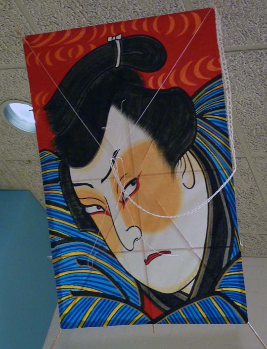
Not many interesting things happen in the small city I live near but occasionally either at the Virginia Museum of Natural History or the Piedmont Arts Association an exhibit will pass through that is worth seeing. One rolled in last week called “Theater of the Sky” so I dropped by on the opening night. It turned out to be a display Japanese kites and kite related uikyo-e (pictures of the floating world) woodblock prints. Uikyo-e refers to a school in 17th to 20th century Japan that sought to depict the life of the contemporary urban merchant class and their entertainments in an idyllic fashion. Along with the rise of large metropolitan areas this newly wealthy and influential segment developed and shaped an environment unlike any before. Not constricted by old class and social rules the term “floating world” was coined to describe it.
"Today's Rising Kites" by Mitani Sadahiro, 1866.
The show was sponsored by The Drachen Foundation which, believe it or not, is an NPO dedicated to the diffusion of kite knowledge and education. The exhibit briefly discussed place that kites and kite flying had in the uikyo-e. Flown at first to bring good fortune or ward off evil spirits they were decorated with symbols of prosperity, good luck, or fertility. Later they found use for communications, divining future harvests, and eventually for recreational uses. Large groups of enthusiasts would gather and populate the sky with these colorfully rendered kites especially in Edo (now known as Tokyo).
"Kite-flying Competition in the Blue Sky" triptych (click for larger image).
The display kites were made by the Japanese kite master Mikio Toki who has been constructing them since 1973. You can see his amazing talent with woodblock printed kites here at his site. The ones in this exhibit were commissioned to replicate an 1864 triptych (Kite-flying Competition in the Blue Sky) featuring popular kabuki actors by the ukiyo-e artist Utagawa Yoshiharu. The vibrant colors and beauty of the traditional Edo kites is astounding and seeing them fly would have been a wonderful spectacle. However, I had to settle with craning my neck to see them as they hung from the dropped ceiling. Oh well.
The "awesome glare" of the Kabuki actor on the right is called nirami.
Click on the thumbnails for a larger image of the kites:
Who was America’s biggest manufacturer of fountain pens in the 1940s and 1950s? Parker? Nope. Sheaffer? Uh-uh. Give up? From their offices in North Bergen, NJ it was common-as-dirt Wearever who crowned themselves that. Certainly that claim could well have been true as mass production allowed a seemingly endless supply of their low cost writing implements to fill up the shelves of many a dime-store. What else may surprise is that they made pens of rather high quality like the one we’re going to look at here.
The late fountain pen expert Frank Dubiel often said Wearever’s Pacemaker model was the equal of many a higher end offering from more respected brands. Looking like a handsome doppelganger to the contemporary striped Parker Duofold it’s easy to believe this pen does meet that criteria. At least at a glance the pen’s appearance belies its $2.75 price.
Taking the pen into had for inspection you can see two features which are attention grabbing. First off, it’s a button filler with a blind cap that unscrews to show the system’s namesake poking out in transparent red plastic. Depressing this button causes a pressure bar in the barrel to flex and squeeze the ink sac. Release the button and the sac inflates drawing in the ink. This system was made famous on early Parkers such as the Duofold (to get around the Sheaffer lever filling patent) but was mostly regulated to niche status as the complex filling system wars began in the 1930’s. Not the most efficient filling system but it certainly is simple and gets the job done.
Wearever Pacemaker
Next item of note is the plain looking nib marked “14k, MADE IN U.S.A.” Most people think of Wearever’s having inexpensive steel nibs but this one is solid gold, as befits a premium offering. It’s a good sized nib with a fine-ish point and a nice blob of iridium at the tip so there’s nothing to criticize here. If Wearever couldn’t get in on the gimmick wars with a filling system or a unique design they did make one concession with what was under that nib: the clear “C-Flow” feed. Supposedly allowing you to see when ink flow started to dwindle and refilling was needed this gadget was a distant relative to the ink view window on other fountain pens. Of course if the feed became mostly clear you probably knew already the ink was running out due skipping or fading lines. So while dubious in use it is a quaint feature that makes this pen (and the Wearever Zenith which shared the feed and nib) a bit more endearing.
C-Flow clear feed
Pacemakers are sized on par with the mid-line offerings from the more expensive pen companies and feel solid in the hand. Concessions to low cost can be seen in the blind cap and section whose bright sheen screams “cheap plastic”. Additionally, the section seems to have been formed from two molded halves since there are seams running down both sides. On the other hand the bulk of the pen is in sturdy, attractive multi-colored laminated celluloid which probably has fooled more than one person into thinking they were looking at a Parker. Gold filled metal is used for the clip and band which on my example has no brassing despite evidence of a goodly amount of use. Overall, this was quite a good deal for a couple of bucks in 1946.
Since the proof is in the pudding I can state that the Pacemaker writes very nicely. I’ve had this pen for almost 10 years and paid little attention to it as it rested silently in a drawer. A short time ago I was looking for some pens to trade and I dipped the old Wearever into ink for a writing sample. When I put the nib to paper I was shocked to find it was semi-flexible! One always expects these mass market mid-century pens to have stiff fine or medium nibs (unless we’re dealing with Esterbrooks and their specialty points) but for whatever reason we get an expressive line with this workhorse. I’m not planning on trading it any time soon now.
A year ago the respected pen collector Don Fluckinger wrote an article titled The Top 10 Vintage Pens, As I See It on Richard Binder’s website. Number two on the list was the Wearever Pacemaker which he called a “hidden gem.” I think that’s an apt description for a pen that for very little money can give a great deal of writing enjoyment.
There’s no way getting around the fact that a lot of vintage pens are made of hard rubber. Before the dawn of plastics it was one of the best materials for the job. Light and strong it’s made when rubber is mixed with sulfur and then cured by heat. Once it’s lathed into a cap and barrel it was often made more esthetically pleasing with heat embossed decoration. Eventually brighter colors, sometimes in patterns, were developed to spruce the “any color you want as long as it’s black” pens up. All those benefits made hard rubber popular for many years until it lost the battle with the early celluloid plastics.
There are negatives as well to hard rubber. One of the worst is that over time the material will discolor to brown or sickly olive green. This is caused by exposure to UV light which oxidizes it as well as exposure to moisture which bonds with free sulfur and creates sulfuric acid on the surface. Either way with time it’s enviable that the surface will sooner or later take on the new and unattractive cast.
It used to be you couldn’t do much for an old pen that wasn’t shiny black anymore but accept it. Buffing the surface exposed undamaged rubber but at the cost of loss of pattern or imprint detail. Black paint lost detail as well by building up a coating on the exterior. If you lucked out and got a mint BHR (black hard rubber) pen you kept it in the dark or used it and took your chances.
Happily a few years ago two methods arrived that promised to restore your drab discolored pens to black beauties. With the process called G-10 a dye is infused into the material and gives it new color. It’s not reversible after application and has to be performed by someone who offers this service. Proponents claim that this makes the newly treated rubber resistant to further damage by blocking UV light and closing the pores in the material against moisture. The other option is Pensbury Manor Black Hard Rubber Pen Potion No. 9 (known from here on out as PMBHRPPNo9) which is a self applied dye. It’s a treatment which is lightly absorbed into the pen’s surface to blacken and protect it in a similar manner to the first process. The coloring can be reversed by using an ammonia/water combination to remove it.
Why are we discussing this? Well, I have a Wahl eyedropper that exhibits a very slight amount of discoloration on one side of the barrel and cap. It was bothering me a bit and since this is not a rare pen I thought I’d finally give re-blackening a try. Since I like to do things myself as well as save money the PMBHRPPNo9 seemed to fit the bill. I ordered it and when it came I decided to first try it on an old heavily discolored pen cap I had in the parts pile. What follows are pictures and text showing this test and the results.
Below is what the PMBHRPPNo9 looks like brushed onto white paper. The washed out look of it doesn’t lead you to believe it will do much to darken the hard rubber.
I used a knock out block and a dowel to hold the cap in an upright position for application and drying (it’s recommended you let the treated parts cure for 8 hours). In the first picture you can see the PMBHRPPNo9, block, brush and untouched cap.
If you look at the close up of the cap you can get an idea of how much it’s turned brown. Before starting you need to clean the parts in an ammonia and water solution so it will be free of oils and other surface contaminants. If you don’t the dye may not bond properly.
Application is as simple as dipping the brush into the solution and applying it in long, even strokes.
After curing I did a little buffing with a cloth to shine up the new surface. In this picture you can see that the section I worked on did indeed get much blacker and shiner.
While not looking exactly “from the factory” fresh, the part of the cap PMBHRPPNo9 was applied to is much more appealing. Of course it’s probably not a good to do this to rare pens where their value might be decreased by messing with the surface. Another thing to consider is that some collectors think any cosmetic changes like this are unacceptable since the natural state of the pen is changed and it could be represented as being in better condition than in actuality. Overall, the process seems like it did not do any damage to the rubber substrate and had very positive visual and tactile result. Not bad if it fits your needs.
Recently music memes have been popping up quite a bit on Facebook and other places. I was reflecting on whether to do one of those when I realized that some songs were closely related to specific years in my life. Sometimes a song can set up a sympathetic resonance with a certain time or event in a way that thinking of one brings the other into focus.
With this in mind I decided to take the last 20 years and pick out a song for each one which vividly caused that vibration in time for me. As I went through those two decades there were some runners-up that were so deserving that I can’t help but comment on them as well. Lastly, just to make this as confusing as possible, I’m going to take them out of sequence and just choose an entry for a year that catches my fancy that day. Eventually all 20 years and (almost) 20 songs will get their moment.
“I’ve got a very irregular head”
Had Roger Keith “Syd” Barrett not withdrawn from the world of music and lived a quiet, modest life for the remaining 36 years he may have just been a footnote to the history of the band he named Pink Floyd. Like Nick Drake, who was a contemporary, this story involves mental illness, reclusiveness, and a small loyal fan base that never let him be forgotten altogether. Often either characterized as a genius who fell to pieces or as a moderately talented artist whose demons led him to drugs and career immolation the truth about Barrett’s life is the mean of those views. In short, Syd Barrett burnt brightly as the creative force behind Pink Floyd’s earliest work only to drop out of the band and then music due to mental illness likely intensified by heavy drug use. It was Barrett’s compositions which created the memorable psychedelic-tinged early Floyd hits like “Bike” and “See Emily Play.” Erratic behavior led to him being eased out of the group starting with A Saucerful of Secrets, their second LP. A brief solo career ensued resulting in two albums: The Madcap Laughs and Barrett (both released in 1970 although Madcap was based on recording from ’68 and ’69.). After having little success with those and a few aborted later ventures he left music for good to garden and paint at his mother’s house in Cambridge until he died in 2006. He never recorded again. Early on in his self imposed exile he attracted a fervent fan base and a mythical persona which made spotting the recluse a notable event. The “Syd Barrett Appreciation Society” even self-published a fanzine, Terrapin, in the mid-70’s to keep his memory alive. Once again like Nick Drake the influence that Barrett had on music was felt but never acknowledged until after his death with quotes like these:
“The few times I saw him perform in London at UFO and the Marquee clubs during the 60s will forever be etched in my mind. He was so charismatic and such a startlingly original songwriter.” –David Bowie
“I wonder what music would be like if he’d never lived.” – Guy Garvey (Elbow)
Syd Barrett: The Madcap Laughs.
As far as my introduction to Syd Barrett is concerned it came about due to the popularity of the band he once led. You couldn’t live during the era that saw the release of Dark Side of the Moon and The Wall without having some exposure to the music of Pink Floyd. The Wall was one of my first purchases in 1984 on that newfangled “compact disc” format. Related events like Laser Floyd at concert venues were an institution that gave teens a purpose for being stoned. Seeing and listening to all this gave me an interest in the earlier works of the band where I discovered the story of Barrett’s career with them. I picked up the first Pink Floyd album, The Piper at the Gates of Dawn, and heard music I liked that didn’t have the current lead singer, Roger Waters, at center stage.
Years later in 1988 I came across the album “Opel” at a record store and purchased it. A compilation of unused takes and unreleased tracks from Barrett’s solo years its immediate appeal to me was the rough, sometimes unfinished, feel of the songs and vocals. He had a talent for writing pieces that would wedge themselves into my head either through lyrical playfulness or blunt emotional force. Later that year I acquired his two solo albums which while more finished still had that ember of instability which made his work interesting.
Listening to this now in comparison to some comparable music of the time like The Soft Machine, Ken Ayers, or Nick Drake I find that Barrett’s solo work seems like a cross between the singer/songwriter and psychedelic genres. He made music that is fragile by way of haunted and in a general sense reflected the aimless and confused feelings I had struggling with early adulthood. The track Opel is the one I listened to most and remember best with its elongated semi-wail that Syd Barrett sings in the final passage. Simple lyrics indeed, but the delivery was what I never forgot:
I’m trying
I’m trying to find you
To find you
I’m living, I’m giving,
To find you, To find you,
I’m living, I’m living,
I’m trying, I’m giving


