The Answer is Carbonite

However, the question is not about ink so I’ll leave it till the end.

C12

We all know carbon since it’s everywhere around us which makes sense since it’s the fourth most common chemical element in the universe. In fact you’re not seeing it right now in front of you since the atmosphere surrounding us contains carbon (apologies to those who live in a vacuum). Burn something and you’ll often find a black carbon residue which if you are making toast doesn’t taste very good. The smelly, thick smoke you see coming out of diesel cars and trucks is exhaust gas laden with microparticles of carbon. If you’ve drawn with charcoal you’ve actually drawn with carbon. While on the subject of making marks pencil “lead” is actually graphite mixed with clay and graphite is carbon.

Ink

Now that we segued into writing implements we can talk about the fun stuff in our pens: ink.  Just about all fountain pen inks are dye based and these colorants are soluble in water resulting in a solution which has no solid bits in it. Is this bringing back any memories of high school chemistry yet? There are complex formulas about how to mix these dyes to make certain ink colors along with additives to promote the inks longevity and stability. This, however, is out of the scope of this post. Whew! I was worried there for a minute.

The other way to get color into a liquid is by adding a pigment. Despite the name there is nothing porcine about it. A common pigmented liquid is paint which gets its color from having little teensy tiny colored bits (the pigment) added to a carrier. Pigments remain in this heterogeneous fluid as solid particles that don’t dissolve which is known as a suspension (more high school chemistry I’m afraid). When pigmented fluids with a binder are used on a substrate like paper the particles get all tangled up in the fiber and stay put on the surface really well. But don’t run out and put an ink that is made like paint into your fountain pen just yet since those are a big no-no in these. The particulates tend to build up and clog the passages that ink travels through and soon your favorite pen is just a short stick with a pointy end.

After wading through all this I assume you are wondering what the point is. Well, what if you could have the positives of a pigment based ink without the negatives? Wouldn’t that be great? Our friend carbon can be refined into very, very tiny particles which theoretically shouldn’t clog a fountain pen and are very black. With that in mind both Sailor and Platinum in Japan have developed fountain pen safe fluid using this technology creating a new category of ink: carbon black.

Testing

Recently one of my favorite people was super nice (thanks Mia!!) and gave me both a bottle of the Platinum carbon black and a sample of the Sailor version of the same. I immediately wondered how they performed especially if compared to each other and a traditional dye based black ink. Since I like to answer obscure questions I did a few tests to determine the shades of grey among black inks.

As a control ink I chose J. Herbin’s Perle Noire black since it is rich, dark, and performed well for me. These attributes made it a good representative sample of dye based inks in this color. The paper I conducted just about all the tests on is my favorite and oft used Clairefontaine 90g gridline white pad.

The pens used in the testing (L to R): Stub, Left Oblique, Right Oblique.

Deciding on what pens to have in this test was a bit harder. First I wanted them to be of the same construction with similar nibs. Next I didn’t think it would hurt to try a pen with a delicate filling and feed system to give the ink a fighting chance of causing some kind of havoc if so inclined. In the end I didn’t have three identical pens but I did have three that were greatly similar with wide, wet nibs that would allow the ink to boldly go onto the paper like no ink had gone before (forgive my lapse into Trek there). Sheaffer Snorkels were my test instruments sporting a stub, a right oblique, and left oblique nibs. An additional plus was that the Snorkel has a rather tricky ink delivery system which met my requirements on the second point. I’ve shown these pens in the image above. Don’t forget to click on this and all of the following ones to see them larger.

Writing

A writing sample of each ink.

I filled the pens and it seemed to me that the carbon inks were a bit thinner. That impression is of course subjective but I can state that the flow quality was very good. All three inks wrote well and there was no way to tell which was which by feel. If you look past my lousy handwriting you’ll see that the two inks in question allowed me to form words and lines without any injury or unexpected explosions. Score one for them!

None of these inks had any bleedthrough on the Clairefontaine paper even though the pens were not stingy in their application of the dark liquids. Drying time was rather quicker for the carbon blacks than for the J. Herbin.

Color

The ink swatches.

Scanning in ink samples is never perfect but I think if you look closely you can see that the Sailor and Platinum lines I wrote (really scribbled) on the sample sheet are not as dark as the Perle Noire. I couldn’t see much difference between the two carbon inks and both seemed greyer in tone than blacks I used normally.

I did a swatch of the three subjects to get a better idea of depth of color. What is seen indeed supports my observation that the carbon black inks are not incredibly dark. To me it seems that the Platinum is darker than the Sailor but if so it’s a very small difference.

Sponge

Rub-a-dub-dub (T to B): Sailor, Platinum, J. Herbin.

One thing advertised about the pigmented carbon inks is that they are “permanent”. I always say nothing is permanent and I think a single match would make a mockery of writing fluids that claim. Barring that how does one determine this in normal circumstances? I can’t wait around for 10, 5, or even .001 years to see if time takes a toll and fades the written pages but I can subject them to a bit of torture.

In this test I took a piece of the sturdy Clairefontaine paper and wrote some line and text on it in the three inks. After a few hours of drying time I took a damp sponge and ran it across them all in one swipe. The results show that the carbon based inks are pretty good at resisting running. The winner was the Platinum ink but the Sailor certainly wasn’t bad.

Soak

Glug, glug (T to B): Sailor, Platinum, J. Herbin.

As long as we’re doing the tests aquatic I decided to give the inks a real workout. In this case I wrote in each ink on the Clairefontaine paper and let them dry an hour before trying the traditional method for determining if a person is a witch. This page was put underwater for 15 minutes and agitated about every minute. When done the sheet was left to dry and you can once again see the lines that held up best were written with the carbon blacks.

Feathering

To conclude this exercise I drew three lines in each ink next to each other not only on my trusty Clairefontaine paper but also on a more absorbent piece of Doane 20lb. The latter paper is typical of what you find in most pads (minus the grid/line layout, of course) and while not ideal for fountain pens it’s good for this test. The results look to me like feathering is minimal on the carbon inks although the Platinum seems to show a bit more than the Sailor. The traditional J. Herbin ink feathers a good deal on the lower quality paper. You can also see the relative blackness of these inks in these samples and Perle Noire most certainly is darkest, like being in a locked closet, compared to the others which are only dark in a waning crescent moon at night way.

So what?

What did we find out? The biggest negative is that Sailor and Platinum carbon black are not as dark as traditional dye based inks. However, this might be made up for by a number of strengths they show such as quick drying time, good permanence in moist conditions, and little feathering. At least they function like a normal ink in the pens I’ve used so I won’t be staying up at night with nightmares of clogged feeds in my head. One last item is that I found Platinum listing a pigment based blue ink on their website. I don’t know anything about it or where it can be bought but it is intriguing and I’d love to give it a try in the future.

The question that the title of this post refers to is: “What was Han Solo encased in for his delivery to Jabba the Hutt?” Was it worth the wait or did you skip down to look at this out of curiosity?

Pen, Paper, Ink, Pugless

The idea that effort can be saved by gathering tasks together to tackle as a single unit is not something that originated with me. Being both lazy and a procrastinator I find myself afloat in a sea of topics and items I wanted to write about but never got around to. Thus I’m applying that principle here in this stitched together post that I hope will intertwine some ink, paper, and pen items sitting around here.

Pen

I single-mindedly comb the world for Sheaffer Snorkels with interesting nibs. My day races by with me obsessively hunched over a monitor, a phone in my hand, utilizing a chip in my cerebral cortex that gives me a direct uplink to the Internet. OK, most of that isn’t true but I do look more often than the average person to see if I can find something cool.

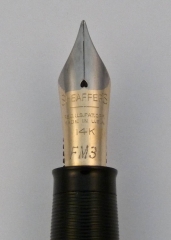
A little while ago I got lucky and found myself a pretty good deal on a Sheaffer Snorkel with a traditional open nib. Not a run-of-the-mill example this had the FM3 marked nib (medium point flexible). These are hard to find (proverbial hens teeth, needle in a haystack, or bit of food a pug won’t eat rare) and when I was the happy owner the bill came to an astounding $22. Lucky? No…it was skill! OK, I got lucky. I thought I was the Baron of Penfindia until a friend found something similar for $11. Descent from smugness is sometimes so rapid you skin your knees.

What is odd is that this nib has less flex and a slightly narrower line than the other FM3 nib I have. It’s still flexible but not as giving as the predecessor nib in my collection. I have a feeling these specialty nibs were more handwork than the vast quantities of fine and medium nibs turned out by Sheaffer and that might explain such variances. Once I did get this pen restored I filled it with Private Reserve Supershow Blue ink and happily doodled away on the next topic of this post.

The $22 flexible Snorkel.

Paper

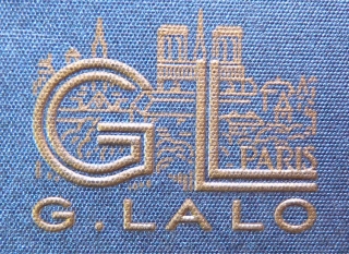
Once again Karen at Exaclair was nice enough to send me a few things to give my hasty and subjective opinions on. One of them was a pad of G. Lalo Vergé de France white paper. I’m used to using the smooth Clairefontaine paper when I need something to make ink form shapes on so this was a nice change. This is laid paper and the factors you immediately notice with this substrate (otherwise known as fancy-schmancy stationary) is it has visible watermarks, a bit of a tooth, and a substantial heft.

What is laid paper? Well, making paper is a lot more complex than most people think. It’s not just like you chop down a tree or mash up some recycling and you have a sheet of the white stuff. There are a number of steps that takes the raw materials through slurry, gets it flat, and then smoothes and dries it. The end product differs depending on the way these procedures are done. The part that we need to look at involves what is called a screen which is for capturing the pulp slurry creating a thin skin and allowing water to drain out of it. As the fibers rest they take on any pattern that is held in the screen like a watermark, for example. Most modern paper is made on a screen of a fine mesh of filaments and imparts a uniform, opaque look to the paper (except for the aforementioned water marks). Laid paper is a more old fashioned method where the screen is made of parallel filaments and the final product shows a ribbed texture when light passes through it.

I like laid finish quite a bit and in fact the boarder around this blog is my scan of some Crane laid note sheets I had on hand. The pattern in the fiber seems to enhance the paper’s attractiveness because it creates visual interest.  Writing on this paper is a different experience from my typical papers since while not extremely rough you do feel the nibs contact on the sheet more. The act of writing somehow feels more formal and special. When I use it I feel all my words are profound and meaningful even though in reality they are incoherent scribbles that I don’t understand a few hours hence.

Specifically the Vergé paper is excellent in all areas. It’s 100gsm with 25% cotton fiber content so isn’t lightweight and shows almost no feathering. At first I thought there was bleed through on the paper but I quickly realized that these sheets are quite translucent and it what was written on the sheets could be seen as light passed through. When placed face down on a table it was less noticeable. That’s not a problem for me and since there are a number of available colors it might not be the case with those. Click on the images below for further enlightenment (or just boredom).

Ink

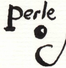
Along with the paper came ink I’ve been wanting to try for a long time. I like black inks but I hate ones that aren’t dark, dark, dark. Also some seem to have a reddish-brown cast on the edges that I really don’t like. I certainly have not tried every black out there but there have been a few on my desk over the years. Knowing that some of the J. Herbin colors aren’t too saturated I wondered how the Perle Noire that arrived would perform. Happily I can report that it is a nice opaque dark black that I’ve not noticed any negatives to yet. There are a lot of black ink comparison reviews in blogland that are quite thorough so I’d recommend taking a look since this is just a quick impression.

Pugless

So we come to the end of my omnibus post. There’s a still a lot of items I need to get to but at least I’ve removed a few from my list. The pugs wonder why they aren’t pictured in this post due to the growing number of fans they seem to have. Maybe next time I’ll see what input they might have but for now the puga donnas will just have to keep snoring.

OK, I gave in. Here’s Mr. Puggy’s reaction to the Snorkel. He tells me it’s beneath his notice.

P1090825-1 November 24, 2009 1

Habana in my Cabana

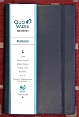
Not too long ago Karen at Exaclair sent me a Quo Vadis Habana notebook to use and, if inclined, relate my thoughts on it. A few words about them before I get any further: Via their blogs, tweets, and other social media presence this company has proven itself to really care about its customers and their feedback. No, I’m not just saying that because I want another notebook. How could you even think that about me? Humph.

I must admit that I was pretty sure how this review would go before I sat down to write it. The Habana notebook pictured uses Clairefontaine paper in it which has been my favorite for years. The paper is smooth to write upon and, important to us fountain pen users, bleed and feather resistant.

The problem was I’m a procrastinator and I didn’t get to writing this entry until just about everyone had already reviewed this notebook doing a much better job of it than I could (like my friend Clem did here). Realizing I needed to come up with a different way to review the notebook, as to not tread over the same old ground, I sat and did my best approximation of thinking. Obviously I needed to push the envelope and do something different, new, and never attempted before. I had to drop the usual paper quality, ink penetration, and binding construction stuff for new frontiers.

Well, if I’m not reviewing the Habana on how it works traditionally as a notebook then what should this newly-styled iconoclast do? Thinking “push that envelope” led me to decide to see how the notebook worked in ways that people not as cutting edge as myself would think of.

At this time from behind me came the loud and rhythmic noises of the dog breed often called the “furry boulders that snore”. That seemed as  good a place as any to go for my unique take on this review. However, as you can see, the Habana Pug Pillow didn’t meet with the approval of Snuffy, pug stationary tester. Also it was hard to clean drool off of. Back to the drawing board!

Snuffy did not approve of the Habana as pillow.

I made a nice, hot cup of tea to sip on as I thought more. Suddenly I had a flash! It was my tongue burning form the hot tea! A few medicinal ice cubes later I really had an idea as you can see below.

Covers flopping open made the Habana tea tray awkward.

Alas, the Habana Tea Tray was not roomy enough to use and got soggy when tea was spilled. Back to square one.

Liking the utilitarian track I was following my next brainstorm was so simple it bordered on not being stupid! Here’s something I could get a lot of mileage out of in my review: the Habana Window Prop! Oh yea, I would go on about how great this was for holding my windows open, creating ventilation and the like. No one has even come close to mentioning that in a review! This was sweet!

The Habana window prop had problems on rainy days.

The major failing here is that we’ve had rain for two days straight now. Remember the soggy comment a little while ago? Unluckily I realized it was time to move on once again.

The idea that there might be a productive, non-traditional twist on this all drove me to go deep, deep into the genius that is my mind. Well, deep is relative and I think shallow genius ain’t nothing to sneeze at. After all, an ant thinks a puddle is an ocean! Sadly, and predictably, this feverish activity went nowhere. I needed to take my mind off of all this and so went about repairing things I had broken trying to repair them earlier. It was while at this another eureka moment occurred!

I never got a clean cut with the Habana saw.

Well, Habana Saw didn’t work out and the bias-cut it made was just awful. I guess I shouldn’t have hitched my philosophy to ants.

I wrote off the idea of finding some use for the Habana and went the opposite direction: totally useless. Being quite the expert at that idea flooded in. Happily that idea had to do with how attractive the basic black Habana was so certainly it should be where people could see it… maybe if I move that vase over there we might have something.

It didn't really work as a objet d'art.
It didn't really work as an objet d'art.

The Display Only Habana just never really *merged* with the décor and caused people make comments like “where’s your vase” and “why the hell do you have a notebook here”. Not an astounding success.

So, I gave up and went back to what I wanted to avoid: a typical review. I will make this brief so you can escape from here quickly. The Quo Vadis Habana has a number of features I do like very much. First is the Calirfontain paper which is the usual high quality, bright, smooth substrate you find in items branded under that name. As always this paper is a fountain pen’s friend with only the slightest feathering and bleed thorough.

The look and feel of the cover on this notebook is quality. It’s soft but firm with the logo embossed on the front and the name on the back. A pocket is on the inside back cover which is very handy when you have receipts in your pocket taking up space but you can’t see anywhere to throw them out. The elastic band that holds it all together is pretty standard as is the ribbon that marks your current page.

The binding is quite interesting in that the spin is very soft and flexible. Most of the back of the book block isn’t glued to the sine so it can lay pretty flat. I did notice that one end did have the spine glued down but only in a small area. I think this is where the ribbon is attached. No matter, this is a nice book to open and spread apart.

The images below show how it reacted to my little writing test so click on them to see the big picture.

The size is larger than what I’m used to but I do like the extra real estate. It will fit into my backpack easily and when on your lap for notes offers a more stable platform for writing.

In the end I’m a fan of this notebook and happy to have gotten a chance to see what it can do if motivated to be all that it can be. I don’t see many negatives other than the ribbon can fray a bit and you can’t use it as a frying pan (that experiment I didn’t document due to the fire.) Although I keep calling it the “Havana” by accident it’s certainly straight forward in all other ways. Just remember it works best as a notebook.

Basic Journal Review

I’ll admit right off that I’m biased. I have two suppliers when I need something to write on: Crane for more formal stationary and Clairefontaine for daily use items like notebooks or pads. That’s why when I discovered the Vice President of Marketing at Exaclair (who distributes Rhodia and Clairefontaine products in the U.S.), Karen Doherty, was offering a notebook for review I jumped on it.

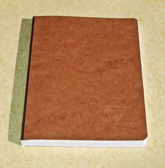
Not too long later I received an example of Clairefontaine’s “Basics” cloth-bound journal in the 6 x 8 ¼ inch size. Looking at the attractive, understated textured brown cover and smooth white, ruled sheets I thought: “So, how do I review this?” Originality is not my strongpoint so I’m going to do what everyone else does with this kind of thing.

First, let’s take a look at the journal itself. It’s spine shows that, indeed, this is clothbound with sewn signatures. When open it’s pretty flexible and lies rather flat. Still, there is a bit of a peak to the page edges nearest the spine but I found this acceptable in this type of binding.

P1040079-20 June 12, 2009 3
Attractive looking journal, I think. (click for larger image. ditto for all pics here)

The paper is 23lb high resistant, pH neutral, white vellum (yes, I got that from a sales blurb) and, as usual, a delight. The wonderfully fountain pen friendly sheets between the covers are the reason I’ve bought Clairefontaine products for so many years. Since I’ve never found a more satisfying paper then this, which you’ll find in many of their products, I haven’t much in the way of criticism.

With that love fest over let’s put some ink on the paper. I used a variety of fountain pens from a Vacumatic with one of my finest (width) nibs to a Danitrio that puts down a small river of ink. As expected feathering is almost non-existent and bleed through very minor in my simple test. One could not ask for more in something like this.

P1040088-29 June 12, 2009 2
Fine to medium nib samples.
P1040101-42 June 12, 2009 1
Nibs that put a good deal of ink down.
P1040096-37 June 12, 2009 4
I see almost no feathering on this paper.
P1040111-52 June 12, 2009 5
This is the back of the page with the high ink-flow nibs. Amazing there's so little ink to see.

The journal itself  does not look or feel “basic” in the least. The grained cardboard covers feel good and are flexible. Rounded corners are another little extra that helps to raise this item above the fray. While this Clairefontaine journal is not incredibly fancy or hand crafted it’s sturdy and delivers in all the important areas. I’d even buy one…but first I’m going to enjoy this free one.