Feed Me

Last post I showed you a few Sheaffer Snorkels with flexible nibs. While I was doing that I took a closer look at them and found a few interesting tidbits which in my pen filled brain were fascinating. If you are as occupied with esoterica as I am you might find it interesting too, but first a little story:

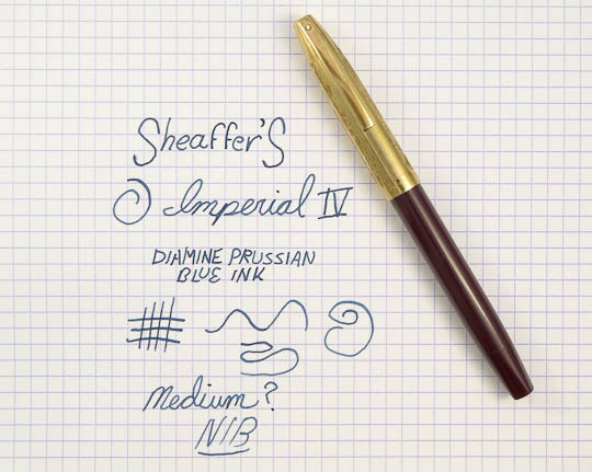
I’ve repaired and built a number of Snorkels usually with good results. However, one I made (the original Frankensnork) wound up with a bit of a problem: ink starvation. That pen had a flexible stub nib and while all seemed well enough I soon was made aware that sometimes (while being exercised by its owner who is well known for the ability stretch pens to their limits) the line being drawn would peter out. Not enough ink flowing to the point during grueling calligraphic maneuvers was the root cause. Of course I felt rather inept at not noticing this when I tested the pen originally and felt I must have overlooked something. My contrition is legendary and all I could do was swear at myself a lot and wonder.

So why did a perfectly fine, to all appearances, Snorkel so act? That old question was on my mind as I disassembled and examined my newest flex Snork.  Imagine my surprise to find that Sheaffers with the flexible nibs had differently constructed feeds! Imagine my surprise that I was too thick to have noticed this before!

In case you don’t know about feeds they are what supply ink from the reservoir to the writing point. The basic function of this piece, usually made out of hard rubber, is to allow ink to flow to the business end via a channel and also contain excess fluid in a ridged part called a comb. This link goes to a good in-depth explanation of how this all works. A delicate balance is maintained by a feed so it can supply enough ink for writing while allow air to pass the opposite way to replace what is drained. If either one of these is slacking in its work you get that starvation I mentioned.

It seems that Sheaffer combated this in the high flow flexible nib Snorkels by creating a super feed that could really move the ink. This brings us to a quick sketch of the complex inner mechanism of a Snorkel, I’m afraid. Hold on through this boring part and you get to see the pretty pictures (well, if you like boring pen bits they are pretty). A Snorkel has a tube that can be extended outwards from under the nib when the knob at the other end of the pen is twisted. An extensive advertising campaign explained this action to be a wonderful boon to mankind in that the pen did not have to be dunked into the ink for filling but only the end of the tube. Yep, no wiping off of the nib when you need to top up the writing fluid. Not quite the same importance as polio vaccine but this was the 50s when automotive tail fins were considered a triumph. I’m not going to go to much farther into how this all works (but here’s a good link to that here) except to say that not only is the ribbed feed under the nib part of the ink delivery unit but so is the tube. Thus, the tube has a thin strip of hard rubber that acts like a feed extension which passes the ink baton to the external one. So, specifically what did Sheaffer do to increase ink flow? Simple, they made the pipes bigger. By that I mean the spots ink flow through were increased in size (quite a bit) so the nib would keep spitting out ink even if the user was ham handed and flexed the heck out of every character they wrote. Let’s take a look in pictures, shall we? Don’t forget to click on them to see them large.

First is a comparison of a flex and non-flex open, two-tone style #3 nib. You’ll see that they look similar enough but upon close inspection the flex nib (with the code FF3 on it) doesn’t have the impressed line that mark the boundary between the silver and the gold sections as the less acrobatic firm medium one. Since the flex nib is thinner (and possibly metallurgically different) I’d wager removal of this embossing was to prevent a weak area that could snap or crack in use. It could have acted like paper when scored to form a crease to ease folding. A bent or broken nib is not something you’d be very happy about while writing a letter. The platinum mask (a thin plating, really) on the flexible nib is applied to mimic the one with the grooves in it. I always like to think there was a back room at the Sheaffer nib works were a few folks labored over these not widely produced nibs with loving care. Yes, overly romantic indeed.

Next let’s look at the feeds that live down below. The picture is of the top of them which comes into contact with the underside of the nibs. You’ll see the one that services our flexible friends has a wider groove down the middle. This is an ink supply channel and larger means more flow. Also, the combs are more widely spaced possibly to retain the expected greater ink overflow.

The last bit in the ink supply chain is the thin hard rubber strip that lives in the tube. The image shows them from end on and the difference is most striking. Look and see how the one out of the flex pen is much more slender allowing it take up far less space so more ink can bustle on through. The bottom of it (facing up in the picture) is actually concave and the top a flat and ungrooved. Remember that capillary action helps to draw the ink forward which is why the tube isn’t just empty, but here we see how almost empty Sheaffer could make one.

In the next two illustrations we see the Snorkel tubes themselves and a top view of the strips from them. I don’t know why the one for the fancy flexible nib is longer but it is. When in the pen it extends from out under the comb feed a tiny bit more than normal. I’ve got a stub flex Snorkel with a #2 style nib (single tone gold) which has the same type of strip in the tube but is the same length as a normal pen. Thus, the length is a mystery to which I can see no obvious explanation. On the other end near the black plug you can see how the tube is also longer there and has a cut out in. I’m not sure about this either but it could be for obtaining ink more rapidly through greater contact.

And so ends our tour of this unique type of pen. I’m no expert and some of my assumptions may be wrong but I hope you found this interesting nonetheless. I say “Vive la Difference!” if it keeps my snorkel happily making weird, varying lines.

Soggy Pasta Primervera

If you’re active in using or collecting fountain pens eventually you will hear the term “flexible”. It’s often used with reverence as when someone gushes “the pen has a nib that is flexible!!” Sometimes you hear such called “wet noodles” which causes no end of confusion as people not familiar with the term try to figure out how long to boil their pen to get it al dente. I’m pretty sure that most people who read this (all 6 or you) will know what a flexible nib is and what it does but that isn’t going to stop me from rambling on and giving a explanation on a kindergarten level. If you are schooled in flex about you might want to skip to the pictures.

Once upon a time skilled individuals created fancy documents with flowing, beautiful script. If you look at historic letters you can see that the lines which make up the letterforms flow in varying widths. For example, a line descending into a curve would become broader in a natural swelling that reminds one of a widening river. The same line usually pinches back to being narrow yet again while it moves along into another letter. One could think of it a bit like brush strokes in painting where more pressure creates a greater ink patch on the paper. However, we are talking about pens and not bristly things.

Mechanically the way it was accomplished is very easy to understand (even for me). Writing tips from the quill to our modern gold nibs have a slit down the middle to the point which directs the ink through capillary action to where you want it on the paper. The narrowest line a nib can make is the width of the point without any (well, hardly any) downward pressure on it.  If you bear down while writing the two sides of the slit, called tines, spread apart creating a wider contact area on the paper. The more pressure means the wider the gap, and thus a wider line. Eventually if the spread is too far apart there would be a loss of capillary action or ink flow which stops the line on the paper which is bad. That’s how it works, Q.E.D.!

So, why is flex so special then? Well, fountain pens today are less able to create line variation. This is because the nibs are thicker and stiffer so the tines don’t move apart much. There’s metallurgy involved as well but I’m not getting into that since its complex and I’m too stupid to fully comprehend it. Let’s just say chances are a modern pen will usually write a predictable line without much variation akin to ballpoints.

As stated this is a change from the past. Early on just about all fountain pens (like their dip pen predecessors) had nibs that would allow for a great deal of flexibility. The systems used to teach cursive or business writing took this into consideration and instructed on when and where to apply pressure to create the standardized but artistic writing styles. Still, for writing in small print for things like accounting there was a need for uniform, thin lines and less flexible points were available. With the advent of things like flimsies and carbon copies stiff nibbed pens become the norm since a firm, regular contact point on the substrate was necessary. To top it all off an inflexible nib is easier and requires less practice to use correctly.

This transformation started in the 30s and by the 50s the vast majority of pens had fine or medium nibs often described as being like nails since their strength would allow them to be driven into wood with no damage. At this time flexible nibs were for specialty uses and not very common.

So, now that we know what a flexible nib is let’s take a look at some I have on hand. Below you’ll see a gallery of 5 nibs that have this quality (click on them for the big view):

Many people use terms like “full-flex” or “semi-flex” to describe a nib’s ability to create the mentioned line variation. There’s no standardized system to measure this and unless the nib is marked this kind of label is based on trial and experience. Luckily, three of the pictured nibs are marked so we know they are officially flexible. The first two are the rather rare beast known as the Sheaffer Snorkel flexisaurus. OK, I made that last word up but you get the idea. You could obtain a wide number of different points on Snorks (16 were listed but when you consider that there were 5 different nibs designs you can imagine the variety) and a number were flexible. Determining if you have such a nib is easy and 100% foolproof if the lightly etched nib codes (in use to 1958, after that you’re out of luck) are still visible. Often these have been polished off by the friction from repeated wiping. In the pictures you can these codes and the meaning is listed in the caption.

The Eversharp nib seen is stamped “flexible” leaving nary a doubt about what it was born as. Rounding these out is a Moore nib that through use can be determined as flexible and an Onoto with a stub nib and the moves to make it at least a semi-flex.

Now that you’ve seen the nibs you might want to see them in action. Well, too bad! I’ve got zero skill in calligraphy and my hand writing looks like I’m three sheets to the wind. OK, I did do something in the way of a demonstration which is that I doodled and recorded it. So below is my first (and maybe last) attempt at being my own A.V. club and I hope you enjoy it.

[media width=”[media width=”540″ link=” height=”350″ link=”http://www.youtube.com/watch?v=89Q_dHfeJew”]


If the video isn’t enough for you for an encore I’ve got some writing samples for you to examine followed by an image of what the whole pens (not just the nibs) look like.

In A Vacuum-Filler No One Can Hear You Scream

Has there ever been a filling system as maligned as the Vacuum-Fil?

Sure there have been! That doesn’t take away from the almost leper like treatment the Sheaffer Vacuum-fillers gets in comparison to lever fillers of the same era. This despite the fact it works very elegantly: On the down stroke a rod pushes a gasket forward which lowers the air pressure in the sealed barrel behind it. A sudden release of the vacuum causes ink to be drawn in to fill the void. There’s an excellent explanation at Richard Binder’s site for those who want in-depth knowledge of how this functions. It all sounds good but there are several meritorious reasons why people have a poor opinion of the system.

First off you’ll never buy an unrestored Vacuum-Fil in working condition. The system functioned well but was not designed to last over 50 years and be like new. The seals are wear points and the filling cycle exacts a lot of stress on them so they fail. No vacuum can be created then and thus no filling.  Another strike against Vacuum-Fillers is that they are very hard to restore and well beyond the average hobbyists’ ability to do so.

It’s not all down side and there are some very nice positives to balance (pun not intended) things. When working they hold a ton of ink so you can write that novel in one filling. Using them is fun since you get to hear the “pop” as the vacuum releases and then see the ink flow up into the pen. Most importantly is that Vacuum-Fillers usually sell for bargain prices even with the cost of restoration factored in.

P1050988-2 August 21, 2009 4
A Sheaffer Vacuum-Fil. (click images for close ups)

With that background out of the way let’s look at the Sheaffer Balance Vacuum-Fil I own. It’s was made in the late 30s and constructed of brown striped Radite (celluloid) plastic. There are a couple things that make this pen a bit odd. The barrel is almost totally clear instead of having the usual thin clear stripes between opaque ones. If you look closely you can see ghost like slightly browner strips but they are almost as clear as their neighbors. Was this a demonstrator pen? I really don’t know and some quick searches in reference books and on the web didn’t turn up any answers.

P1050971-8 August 21, 2009 2
The very clear barrel.

Another nice thing about this Balance is the crisp stub nib it has. Finding an oddball nib on a Sheaffer of this era is always fun. The majority of the pens from the Fort Madison firm in the 1930s always seem to have staid fine or medium points and I jump for joy seeing something like this.

P1050965-6 August 21, 2009 1
The stub nib.

Filling the pen, as stated, is fun but writing with it is more so. The nib has a little tooth but isn’t fussy to write with and has lovely line variation. It’s a stub you could live with on a daily basis since it never intrudes to tell you that you need to pay it special attention. Add this to the pen’s nice mid-sized frame and classic bullet shape and I’m certainly not going to disparage it. However, I know that it calls me a ridiculous pen kook behind my back.

P1060381-186 August 25, 2009 1
Writing sample of this pen. Click on image for close up.

Supershow in DC

Last weekend I hit the road to travel to Northern Virginia to attend the Washington D.C. Collectible Fountain Pen Supershow. It’s the largest pen event in the world (according to its web page at least.)

To answer the question I know you have: Yes, it is overwhelming. My brain turned to mush rather quickly as I aimlessly wandered around. Luckily my first day there I was accompanied by two wonderful people who were kind enough to put up with me. On top of that sacrifice Kim and Telf chose a great Thai restaurant for a pen lunch. It’s always good to know someone else’s feet hurt and head is swimming at times like these.

There was something for everyone who likes pens there. Vintage pens, modern pens, stationary, parts, and some weird stuff. I’m rather quiet but the people I talked to were very helpful and didn’t mind stupid questions. This was especially true of Aaron and Kim Svabik of Pentiques who generously spent some time conversing with me.

Indeed I got to do and see some great things. Viewing the large educational display of all the colors and models of Sheaffer Snorkels was incredible. I also got to sample some great Nakaya pens with specialty nibs at the Nibs.com table which is something I’ve wanted to do forever.

I left at the end of my visit rather tired and dizzy but satisfied I’d been to the show of shows. Enjoy some pictures I took below.

More Imperial IV You

The post before last I showed some pictures of a Sheaffer Imperial that I was restoring. I’ve finished it and thought I’d put the pictures of the final product up here with a few comments.

P1050045-3 July 20, 2009 large 1
A bit of color and an Imperial IV.

The Imperial has had many versions and a long production run. The one most people think of when hearing the name is what we have here, a Sheaffer Imperial IV.  Introduced in 1963 and made till 1968 (with a reintroduction of the basic look and name from 1995 to 1998) some people might say this was the last classic that Sheaffer turned out. You’d probably be more prone to say that if you didn’t like the pen that replaced this one, dubbed the Targa, which was sold for decades. That’s another story.

Made to look like a thinner Pen For Men (PFM) the Imperial has a sleek, attractive design. I’m fond of this model no matter what variation because they write and work well. They were also among the last Sheaffers to have the Touchdown filling system. The years this pen was made pinpoint when the cartridge overtook pens with permanent ink reservoirs. As the cartridge fill Imperial got more popular less and less Touchdowns were made until they disappeared.

Although you can see this example has been used for many years it still works great with no functional problems. It writes a nice smooth medium line and it a pleasure to doodle with. I was going to end this with some pun having to do with empire but I think the post title is bad enough.

A few doodles.
A few doodles.

Imperialism

A friend sent me a special pen to see if I could get it working again. It belonged to his Godmother and displays her name proudly on the barrel. Oddly enough one of her two surnames was condensed to a single initial which makes it seem like this was either a present or that the stationers who engraved it couldn’t hot stamp that many characters and took a strange shortcut.

The pen is an early Sheaffer Imperial IV with Touchdown filling. Imperials went up to VIII with each increment a slightly fancier pen. They were made as cartridge/converter fillers as well. If you want the whole scoop check out the excellent article at PenHero.com. This one’s section unit seemed pretty gummed up so I decided to take it apart for a thorough cleaning. I’ve got a similar later Imperial section that I disassembled first to make sure I was familiar with the procedure before working on the heirloom pen.

IMG_0008-8 July 08, 2009 2
Note markings on early and later shells. (click to see larger)

The first oddity I noticed was the difference in the markings on the nib between the two. My friend’s said “Sheaffer’S” in the style you see on older vintage pens from that manufacturer. My nib just said “Sheaffer” in the block letters I’m used to seeing on those pens from the 60’s and later. A quick web search and I found that the former company logotype was on the first Imperials and it changed over in the mid-60s it seems.

IMG_0019-19 July 08, 2009 3
Later shell on left is cutout. One on right is enclosed.

Even odder that the markings was the structural differences I saw. On the newer Imperial section the front of the feed is exposed through a cut-out in the shell. It was what I was used to seeing on this model. However, the older one had the feed totally encased in the section and a small ink intake hole under the point was the only opening I could see. When I took them both apart you could see a larger end on the newer feed and a smaller one to fit inside the outer cover on the other. Not too much else was different except for a shorter feed channel and no joint washer on the earlier pen.

IMG_0034-34 July 09, 2009 1
Old section parts on top, new on bottom. (Click to see part labels)

Still, it’s a pretty major running change for a pen and I’m not sure why they did it. It could have been due to problems noticed with ink flow or a problem flushing the older design out easily. The answer might never be known. When this pen is finished I’ll evaluate how it writes and see if it is lacking in some way.

Overall the Imperial is a great, well made pen that is often overlooked. I can’t wait till this one is up and running again.

Insert Lithp Here

It’s odd how the internet can extend your reach. I can buy goods from places I never heard about as a child. I read people’s thoughts from lands I didn’t expect to glean insights from. I see images taken minutes, even seconds, after events extremely remote to me. Beyond all that what still strikes me as the most unbelievable is I have friends on the other side of this planet whom I’ve never actually met.

How that happened is a long and rather boring story. Logic dictates that the underlying reason is that my likability is directly proportional to the distance you are away from me (Overfield’s law). If  I lived on the moon the entire world would love me. What all of the people I know overseas have in common is using and collecting that odd throwback I love: fountain pens. Forming a small (but rapidly growing) group centered in metro Manila they meet for food, friendship, and fountain pens (is that the “3 Fs”?) How do I know this? After corresponding with one of the members I started following these gatherings online via Jenny Ortuoste’s blog or photos sent directly to me by people such as Leigh Reyes (blog plug). Now I can supplement that with quite a few picture galleries put up by attendees on Facebook. This happy band calls themselves the Fountain Pen Network-Philippines or FPN-P for short.

The reason I like this group so much (besides the fact that some members will actually put up with me) is their enthusiasm and camaraderie. It always looks fun when they meet at someone’s home, get a room in a tasty looking restaurant, or even take over a whole coffee shop to see pens, talk pens, use pens, and eat (not pens). Often they go out for sightseeing and pen paraphernalia hunts afterward. I’ve been at pen meets that were barely alive by comparison. The people are all ages and from all walks of life including a broadcaster, an award winning novelist/playwright, an advertising executive, professors, business people, creative professionals, writers, students, etc. etc. Certainly it’s a diverse and interesting group of folks. Seeing young people interested in what some think stodgy like fountain pens is rare, but there are some here. I never thought I’d use the term “young people” in a sentence…I am getting old.

This is leading up to my mention of another ritual they have at the meets: raffles. Members bring in items and all are raffled off to attendees for free. Last time they met there were so many items a second round of drawings had to be made. Everyone (or nearly so) seems to come away with a nifty doodad given out of the goodness of another person’s heart. Pens, notebooks, inks, and even panda shaped pens are put into the great redistribution pool. Next month is the meeting that will mark their one year anniversary and the raffle is sure to be bigger and better than ever. Also, odd as it might seem, I’ll be sending a couple things 8,000 miles for it as kind of a thank you for enjoying a bit of the fun remotely and being able to meet so many good people at the same time.

So….all gaze upon RAFFLESTEIN and his trusty helper PENCIGOR!!! (um…at the top of the page.) A more monstrous pair has never been seen in the pen world. I found just enough leftover parts for what may be my last Frankensnork class pen. It’s green, brown, and blue which I think is a nice color combination. The barrel comes from a desk pen since Sheaffer never made a brown pocket pen. Finishing it off is a Palladium-Silver triumph nib (fine) which has the script identification on it I find so charming. Pencigor has a top from a tuckaway pencil contrasting with a generic bottom assembly.

p1040055-2-june-10-2009-1
Pd-Ag nib.

So congratulations to my friends in the other hemisphere on their 1 year anniversary. I hope there are many more. Oh, and whoever wins this owes me some adobo if I ever visit. 🙂

untitled-5-1-june-10-2009-1
Rafflestein writing sample.

Redipoint, Set, Go!

Brown & Bigelow of St. Paul, MN knows promotional products. In 1896 they came out with some of the first advertising calendars and eventually created many iconic ones like the Norman Rockwell Boy Scouts of America series. They did more than just that, though. The “Redipoint” pencil was a B&B product usually sporting the name or logo of a business on the barrel. You’ll be happy to know they still are in the same line of business today.

In 1922 William H. Ingersoll, the marketing maven for the Ingersoll Watch Company (“The Watch That Made the Dollar Famous”) left that industry after a takeover of the eponymous company. He went to the Redipoint Company which reorganized as Ingersoll Redipoint. Still distributed by B&B the products of this company continued to rely heavily on promotional writing instruments. Besides pencils they also had a line of plastic and metal fountain pens one of which is the topic of this post.

may-22-2009-1-blog-p1030004
Redipoint pen and paraphernalia. (click for larger image)

The fountain pen shown here is a very nice insurance promotional item. The top has an enameled company name and you can find identical pens with variety of companies and cities in this spot. The Redipoint pen itself has a gold-filled metal barrel and cap covered with a fleurs-de-lis design. It’s similar to a Wahl metal pen of the same era in looks and the lever filling system. The nib is a semi-flex medium which really can put down a good amount of ink. Overall it’s quite nice for a piece of insurance advertising.

Pictured here is a near mint example with all the original paperwork. Sometime in 1924 Mrs. G. E. Sanford got this pen at Christmas but didn’t use it very much. I have no idea where it lived for the many intervening years until the pen found itself on the other side of the world with my friend in Metro Manila. It did come back to this hemisphere and stayed a little while with me before I gave it this past weekend as a graduation present to a good friend.  So the legacy of Mrs. Sanford of Bunker Hill, IL lives on in an odd way.

may-22-2009-1-blog-p1030015

Tippy Dippy Touchdown

20090521-sheaffertipdiplogo

I never liked the term “cheap and cheerful” since it always conjured up an image of someone who relished penny-pinching to me. But if any pen really deserved that moniker the Sheaffer Touchdown Cadet Tip-dip model does. Why? Let’s pop the pen out of its packaging and see.

The Cadet has a bit in common with an Esterbrook pen. First off, the nib is stainless steel and part of a threaded unit that screws into the section for easy replacement. Both those traits it has in common with the renowned low-priced Esterbrook line. But when you look for a lever to fill the pen and can’t find one the similarities end. Unscrewing and pulling up on the blind caps exposes the trademark metal tube of Sheaffer’s pneumatic touchdown filling system. The other feature, the “Tip-dip”, turns out to be a small recess in the feed under the nib where the ink channel is exposed. This was intended to allow the pen to fill with minimal dunking depth in ink.

My example of this fountain pen was a NOS blister packed version that had and extra nib thrown in which was, glory be, a stub. Nowhere on it does it say “cadet” but that’s what it has been called in the old catalogs. Like the more expensive Sheaffer pens a whole range of nibs were available for the tippys including flexible styles. As mentioned it is made of stainless steel but there is a nice amount of tipping material at the end.

Sheaffer stainless steel tip-dip nib.

How does this early 60’s low cost pen feel to write with? Great, I must say. The pen is substantial but light weight and the point is smooth with some line variation. Construction is exemplary with high quality plastics and metals. I’ve been inside the pen too and can report it is made just as well as the expensive touchdown models.

I would certainly recommend a vintage tip-dip pen to anyone looking for a practical and economical writer. It turned out that this inexpensive vintage pen is an attractive, solid writing instrument which is far more “cheerful” than “cheap”.

may-20-2009-1-blog-p1020997
Cadet writing sample.

Mystery Point/Counterpoint III

I promised to proffer my guess on the mystery nib affixed to the Tuckaway I talked about in the posts Mystery Point/Counterpoint and Mystery Point/Counterpoint II. I had an unfair advantage, though, in this since I have a few more Sheaffer catalogs than just the one I showed the page from already. Take a look at the page from few years later below. It’s still an illustration without too much detail but I think it shows the shapes a bit better. Considering that the point has quite rounded shoulders and the nib does not exhibit too much curving inwards at the top leads me to my guess that the nib in question is a flexible coarse. Of course we’ll probably never know the truth.

Sheaffer nibs for 1953.