I’m So Blue

It is good that Sheaffer Snorkels came in colors. I find just having the choice of a pen in one hue to be rather boringly monochromatic. In the wacky world of collecting there are always some items that stand out in rarity due to such things as size, material, pattern and other differentiating characteristics. With Snorkels color is an important variable (along with nib type and build material) in determining value.

There are two separate periods when Sheaffer messed with color choices for these pens. The early pocket pens were made in what I’ll call (not that it’s unique to me) the “pastel” colors. These were Black, Pastel Blue, Pastel Green, Burgundy, and Pastel Grey. All pleasant colors but as 1956 dawned the U.S. was awash with fancy named choices for the finishes on the cars, appliances, and furniture people wanted. When a Cadillac could be had in bahama blue why not your pen? It was with thinking like that a new range of crazy colors was added to the Snorkel lineup: Fiesta Red, Vermilion, Mandarin Orange, Sage Green, Fern Green, Peacock Blue, Periwinkle Blue, and Buckskin Tan.

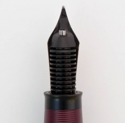
I’ve got most of the colors above and keep my eyes peeled for when rarer examples like Mandarin Orange appear. Another one that’s hard to get one’s hands on is Peacock Blue. The problem is that pictures of blue Snorkels tend be hard to interpret as pastel blue and peacock blue could look alike depending on exposure, lighting, camera quality, etc. I’ve seen many a pen for sale that looked “Peacocky” and just turned out to be over exposed. In order to help the two or maybe even three people who care about this I will provide the number of a good therapist. Actually, I’ll just show a photo I took of two side by side so you can see the difference. It probably won’t help too much but you never know.

Paste Blue set on the left and to the right is a Peacock Blue set.

Pen, Paper, Ink, Pugless

The idea that effort can be saved by gathering tasks together to tackle as a single unit is not something that originated with me. Being both lazy and a procrastinator I find myself afloat in a sea of topics and items I wanted to write about but never got around to. Thus I’m applying that principle here in this stitched together post that I hope will intertwine some ink, paper, and pen items sitting around here.

Pen

I single-mindedly comb the world for Sheaffer Snorkels with interesting nibs. My day races by with me obsessively hunched over a monitor, a phone in my hand, utilizing a chip in my cerebral cortex that gives me a direct uplink to the Internet. OK, most of that isn’t true but I do look more often than the average person to see if I can find something cool.

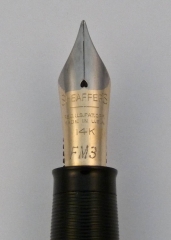
A little while ago I got lucky and found myself a pretty good deal on a Sheaffer Snorkel with a traditional open nib. Not a run-of-the-mill example this had the FM3 marked nib (medium point flexible). These are hard to find (proverbial hens teeth, needle in a haystack, or bit of food a pug won’t eat rare) and when I was the happy owner the bill came to an astounding $22. Lucky? No…it was skill! OK, I got lucky. I thought I was the Baron of Penfindia until a friend found something similar for $11. Descent from smugness is sometimes so rapid you skin your knees.

What is odd is that this nib has less flex and a slightly narrower line than the other FM3 nib I have. It’s still flexible but not as giving as the predecessor nib in my collection. I have a feeling these specialty nibs were more handwork than the vast quantities of fine and medium nibs turned out by Sheaffer and that might explain such variances. Once I did get this pen restored I filled it with Private Reserve Supershow Blue ink and happily doodled away on the next topic of this post.

The $22 flexible Snorkel.

Paper

Once again Karen at Exaclair was nice enough to send me a few things to give my hasty and subjective opinions on. One of them was a pad of G. Lalo Vergé de France white paper. I’m used to using the smooth Clairefontaine paper when I need something to make ink form shapes on so this was a nice change. This is laid paper and the factors you immediately notice with this substrate (otherwise known as fancy-schmancy stationary) is it has visible watermarks, a bit of a tooth, and a substantial heft.

What is laid paper? Well, making paper is a lot more complex than most people think. It’s not just like you chop down a tree or mash up some recycling and you have a sheet of the white stuff. There are a number of steps that takes the raw materials through slurry, gets it flat, and then smoothes and dries it. The end product differs depending on the way these procedures are done. The part that we need to look at involves what is called a screen which is for capturing the pulp slurry creating a thin skin and allowing water to drain out of it. As the fibers rest they take on any pattern that is held in the screen like a watermark, for example. Most modern paper is made on a screen of a fine mesh of filaments and imparts a uniform, opaque look to the paper (except for the aforementioned water marks). Laid paper is a more old fashioned method where the screen is made of parallel filaments and the final product shows a ribbed texture when light passes through it.

I like laid finish quite a bit and in fact the boarder around this blog is my scan of some Crane laid note sheets I had on hand. The pattern in the fiber seems to enhance the paper’s attractiveness because it creates visual interest.  Writing on this paper is a different experience from my typical papers since while not extremely rough you do feel the nibs contact on the sheet more. The act of writing somehow feels more formal and special. When I use it I feel all my words are profound and meaningful even though in reality they are incoherent scribbles that I don’t understand a few hours hence.

Specifically the Vergé paper is excellent in all areas. It’s 100gsm with 25% cotton fiber content so isn’t lightweight and shows almost no feathering. At first I thought there was bleed through on the paper but I quickly realized that these sheets are quite translucent and it what was written on the sheets could be seen as light passed through. When placed face down on a table it was less noticeable. That’s not a problem for me and since there are a number of available colors it might not be the case with those. Click on the images below for further enlightenment (or just boredom).

Ink

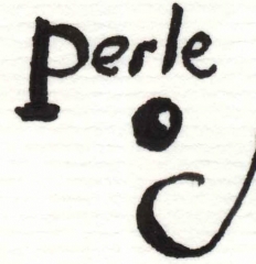
Along with the paper came ink I’ve been wanting to try for a long time. I like black inks but I hate ones that aren’t dark, dark, dark. Also some seem to have a reddish-brown cast on the edges that I really don’t like. I certainly have not tried every black out there but there have been a few on my desk over the years. Knowing that some of the J. Herbin colors aren’t too saturated I wondered how the Perle Noire that arrived would perform. Happily I can report that it is a nice opaque dark black that I’ve not noticed any negatives to yet. There are a lot of black ink comparison reviews in blogland that are quite thorough so I’d recommend taking a look since this is just a quick impression.

Pugless

So we come to the end of my omnibus post. There’s a still a lot of items I need to get to but at least I’ve removed a few from my list. The pugs wonder why they aren’t pictured in this post due to the growing number of fans they seem to have. Maybe next time I’ll see what input they might have but for now the puga donnas will just have to keep snoring.

OK, I gave in. Here’s Mr. Puggy’s reaction to the Snorkel. He tells me it’s beneath his notice.

P1090825-1 November 24, 2009 1

Feed Me

Last post I showed you a few Sheaffer Snorkels with flexible nibs. While I was doing that I took a closer look at them and found a few interesting tidbits which in my pen filled brain were fascinating. If you are as occupied with esoterica as I am you might find it interesting too, but first a little story:

I’ve repaired and built a number of Snorkels usually with good results. However, one I made (the original Frankensnork) wound up with a bit of a problem: ink starvation. That pen had a flexible stub nib and while all seemed well enough I soon was made aware that sometimes (while being exercised by its owner who is well known for the ability stretch pens to their limits) the line being drawn would peter out. Not enough ink flowing to the point during grueling calligraphic maneuvers was the root cause. Of course I felt rather inept at not noticing this when I tested the pen originally and felt I must have overlooked something. My contrition is legendary and all I could do was swear at myself a lot and wonder.

So why did a perfectly fine, to all appearances, Snorkel so act? That old question was on my mind as I disassembled and examined my newest flex Snork.  Imagine my surprise to find that Sheaffers with the flexible nibs had differently constructed feeds! Imagine my surprise that I was too thick to have noticed this before!

In case you don’t know about feeds they are what supply ink from the reservoir to the writing point. The basic function of this piece, usually made out of hard rubber, is to allow ink to flow to the business end via a channel and also contain excess fluid in a ridged part called a comb. This link goes to a good in-depth explanation of how this all works. A delicate balance is maintained by a feed so it can supply enough ink for writing while allow air to pass the opposite way to replace what is drained. If either one of these is slacking in its work you get that starvation I mentioned.

It seems that Sheaffer combated this in the high flow flexible nib Snorkels by creating a super feed that could really move the ink. This brings us to a quick sketch of the complex inner mechanism of a Snorkel, I’m afraid. Hold on through this boring part and you get to see the pretty pictures (well, if you like boring pen bits they are pretty). A Snorkel has a tube that can be extended outwards from under the nib when the knob at the other end of the pen is twisted. An extensive advertising campaign explained this action to be a wonderful boon to mankind in that the pen did not have to be dunked into the ink for filling but only the end of the tube. Yep, no wiping off of the nib when you need to top up the writing fluid. Not quite the same importance as polio vaccine but this was the 50s when automotive tail fins were considered a triumph. I’m not going to go to much farther into how this all works (but here’s a good link to that here) except to say that not only is the ribbed feed under the nib part of the ink delivery unit but so is the tube. Thus, the tube has a thin strip of hard rubber that acts like a feed extension which passes the ink baton to the external one. So, specifically what did Sheaffer do to increase ink flow? Simple, they made the pipes bigger. By that I mean the spots ink flow through were increased in size (quite a bit) so the nib would keep spitting out ink even if the user was ham handed and flexed the heck out of every character they wrote. Let’s take a look in pictures, shall we? Don’t forget to click on them to see them large.

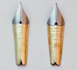
First is a comparison of a flex and non-flex open, two-tone style #3 nib. You’ll see that they look similar enough but upon close inspection the flex nib (with the code FF3 on it) doesn’t have the impressed line that mark the boundary between the silver and the gold sections as the less acrobatic firm medium one. Since the flex nib is thinner (and possibly metallurgically different) I’d wager removal of this embossing was to prevent a weak area that could snap or crack in use. It could have acted like paper when scored to form a crease to ease folding. A bent or broken nib is not something you’d be very happy about while writing a letter. The platinum mask (a thin plating, really) on the flexible nib is applied to mimic the one with the grooves in it. I always like to think there was a back room at the Sheaffer nib works were a few folks labored over these not widely produced nibs with loving care. Yes, overly romantic indeed.

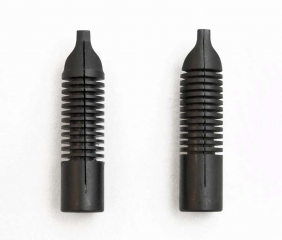
Next let’s look at the feeds that live down below. The picture is of the top of them which comes into contact with the underside of the nibs. You’ll see the one that services our flexible friends has a wider groove down the middle. This is an ink supply channel and larger means more flow. Also, the combs are more widely spaced possibly to retain the expected greater ink overflow.

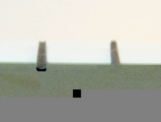
The last bit in the ink supply chain is the thin hard rubber strip that lives in the tube. The image shows them from end on and the difference is most striking. Look and see how the one out of the flex pen is much more slender allowing it take up far less space so more ink can bustle on through. The bottom of it (facing up in the picture) is actually concave and the top a flat and ungrooved. Remember that capillary action helps to draw the ink forward which is why the tube isn’t just empty, but here we see how almost empty Sheaffer could make one.

In the next two illustrations we see the Snorkel tubes themselves and a top view of the strips from them. I don’t know why the one for the fancy flexible nib is longer but it is. When in the pen it extends from out under the comb feed a tiny bit more than normal. I’ve got a stub flex Snorkel with a #2 style nib (single tone gold) which has the same type of strip in the tube but is the same length as a normal pen. Thus, the length is a mystery to which I can see no obvious explanation. On the other end near the black plug you can see how the tube is also longer there and has a cut out in. I’m not sure about this either but it could be for obtaining ink more rapidly through greater contact.

And so ends our tour of this unique type of pen. I’m no expert and some of my assumptions may be wrong but I hope you found this interesting nonetheless. I say “Vive la Difference!” if it keeps my snorkel happily making weird, varying lines.

Soggy Pasta Primervera

If you’re active in using or collecting fountain pens eventually you will hear the term “flexible”. It’s often used with reverence as when someone gushes “the pen has a nib that is flexible!!” Sometimes you hear such called “wet noodles” which causes no end of confusion as people not familiar with the term try to figure out how long to boil their pen to get it al dente. I’m pretty sure that most people who read this (all 6 or you) will know what a flexible nib is and what it does but that isn’t going to stop me from rambling on and giving a explanation on a kindergarten level. If you are schooled in flex about you might want to skip to the pictures.

Once upon a time skilled individuals created fancy documents with flowing, beautiful script. If you look at historic letters you can see that the lines which make up the letterforms flow in varying widths. For example, a line descending into a curve would become broader in a natural swelling that reminds one of a widening river. The same line usually pinches back to being narrow yet again while it moves along into another letter. One could think of it a bit like brush strokes in painting where more pressure creates a greater ink patch on the paper. However, we are talking about pens and not bristly things.

Mechanically the way it was accomplished is very easy to understand (even for me). Writing tips from the quill to our modern gold nibs have a slit down the middle to the point which directs the ink through capillary action to where you want it on the paper. The narrowest line a nib can make is the width of the point without any (well, hardly any) downward pressure on it.  If you bear down while writing the two sides of the slit, called tines, spread apart creating a wider contact area on the paper. The more pressure means the wider the gap, and thus a wider line. Eventually if the spread is too far apart there would be a loss of capillary action or ink flow which stops the line on the paper which is bad. That’s how it works, Q.E.D.!

So, why is flex so special then? Well, fountain pens today are less able to create line variation. This is because the nibs are thicker and stiffer so the tines don’t move apart much. There’s metallurgy involved as well but I’m not getting into that since its complex and I’m too stupid to fully comprehend it. Let’s just say chances are a modern pen will usually write a predictable line without much variation akin to ballpoints.

As stated this is a change from the past. Early on just about all fountain pens (like their dip pen predecessors) had nibs that would allow for a great deal of flexibility. The systems used to teach cursive or business writing took this into consideration and instructed on when and where to apply pressure to create the standardized but artistic writing styles. Still, for writing in small print for things like accounting there was a need for uniform, thin lines and less flexible points were available. With the advent of things like flimsies and carbon copies stiff nibbed pens become the norm since a firm, regular contact point on the substrate was necessary. To top it all off an inflexible nib is easier and requires less practice to use correctly.

This transformation started in the 30s and by the 50s the vast majority of pens had fine or medium nibs often described as being like nails since their strength would allow them to be driven into wood with no damage. At this time flexible nibs were for specialty uses and not very common.

So, now that we know what a flexible nib is let’s take a look at some I have on hand. Below you’ll see a gallery of 5 nibs that have this quality (click on them for the big view):

Many people use terms like “full-flex” or “semi-flex” to describe a nib’s ability to create the mentioned line variation. There’s no standardized system to measure this and unless the nib is marked this kind of label is based on trial and experience. Luckily, three of the pictured nibs are marked so we know they are officially flexible. The first two are the rather rare beast known as the Sheaffer Snorkel flexisaurus. OK, I made that last word up but you get the idea. You could obtain a wide number of different points on Snorks (16 were listed but when you consider that there were 5 different nibs designs you can imagine the variety) and a number were flexible. Determining if you have such a nib is easy and 100% foolproof if the lightly etched nib codes (in use to 1958, after that you’re out of luck) are still visible. Often these have been polished off by the friction from repeated wiping. In the pictures you can these codes and the meaning is listed in the caption.

The Eversharp nib seen is stamped “flexible” leaving nary a doubt about what it was born as. Rounding these out is a Moore nib that through use can be determined as flexible and an Onoto with a stub nib and the moves to make it at least a semi-flex.

Now that you’ve seen the nibs you might want to see them in action. Well, too bad! I’ve got zero skill in calligraphy and my hand writing looks like I’m three sheets to the wind. OK, I did do something in the way of a demonstration which is that I doodled and recorded it. So below is my first (and maybe last) attempt at being my own A.V. club and I hope you enjoy it.

[media width=”[media width=”540″ link=” height=”350″ link=”http://www.youtube.com/watch?v=89Q_dHfeJew”]


If the video isn’t enough for you for an encore I’ve got some writing samples for you to examine followed by an image of what the whole pens (not just the nibs) look like.

Insert Lithp Here

It’s odd how the internet can extend your reach. I can buy goods from places I never heard about as a child. I read people’s thoughts from lands I didn’t expect to glean insights from. I see images taken minutes, even seconds, after events extremely remote to me. Beyond all that what still strikes me as the most unbelievable is I have friends on the other side of this planet whom I’ve never actually met.

How that happened is a long and rather boring story. Logic dictates that the underlying reason is that my likability is directly proportional to the distance you are away from me (Overfield’s law). If  I lived on the moon the entire world would love me. What all of the people I know overseas have in common is using and collecting that odd throwback I love: fountain pens. Forming a small (but rapidly growing) group centered in metro Manila they meet for food, friendship, and fountain pens (is that the “3 Fs”?) How do I know this? After corresponding with one of the members I started following these gatherings online via Jenny Ortuoste’s blog or photos sent directly to me by people such as Leigh Reyes (blog plug). Now I can supplement that with quite a few picture galleries put up by attendees on Facebook. This happy band calls themselves the Fountain Pen Network-Philippines or FPN-P for short.

The reason I like this group so much (besides the fact that some members will actually put up with me) is their enthusiasm and camaraderie. It always looks fun when they meet at someone’s home, get a room in a tasty looking restaurant, or even take over a whole coffee shop to see pens, talk pens, use pens, and eat (not pens). Often they go out for sightseeing and pen paraphernalia hunts afterward. I’ve been at pen meets that were barely alive by comparison. The people are all ages and from all walks of life including a broadcaster, an award winning novelist/playwright, an advertising executive, professors, business people, creative professionals, writers, students, etc. etc. Certainly it’s a diverse and interesting group of folks. Seeing young people interested in what some think stodgy like fountain pens is rare, but there are some here. I never thought I’d use the term “young people” in a sentence…I am getting old.

This is leading up to my mention of another ritual they have at the meets: raffles. Members bring in items and all are raffled off to attendees for free. Last time they met there were so many items a second round of drawings had to be made. Everyone (or nearly so) seems to come away with a nifty doodad given out of the goodness of another person’s heart. Pens, notebooks, inks, and even panda shaped pens are put into the great redistribution pool. Next month is the meeting that will mark their one year anniversary and the raffle is sure to be bigger and better than ever. Also, odd as it might seem, I’ll be sending a couple things 8,000 miles for it as kind of a thank you for enjoying a bit of the fun remotely and being able to meet so many good people at the same time.

So….all gaze upon RAFFLESTEIN and his trusty helper PENCIGOR!!! (um…at the top of the page.) A more monstrous pair has never been seen in the pen world. I found just enough leftover parts for what may be my last Frankensnork class pen. It’s green, brown, and blue which I think is a nice color combination. The barrel comes from a desk pen since Sheaffer never made a brown pocket pen. Finishing it off is a Palladium-Silver triumph nib (fine) which has the script identification on it I find so charming. Pencigor has a top from a tuckaway pencil contrasting with a generic bottom assembly.

p1040055-2-june-10-2009-1
Pd-Ag nib.

So congratulations to my friends in the other hemisphere on their 1 year anniversary. I hope there are many more. Oh, and whoever wins this owes me some adobo if I ever visit. 🙂

untitled-5-1-june-10-2009-1
Rafflestein writing sample.

Franky and Fans

Frankys in order: Bride of, Thinenstein, Son of.
Frankies in order: Bride of, Thinenstein, Son of.

If you’ve been collecting, fixing, and futzing with pens for as long as I have you wind up with a lot of pen parts. Often these bits are leftovers from a broken pen you may have bought to salvage parts from to fix another. You hope that someday you’ll need some of the leftover pieces but unless you do pen repair as a business (which I do not) they’ll just gather dust.

A while ago I was rummaging through my cabinet of pen curiosities and realized I had a lot of Sheaffer Snorkel parts. There were more than enough to make quite a few pens out of. The down side was that there were not enough parts of the same color to make a monotone pen except for black. Black, although suitable for all formal occasions, is quite a boring pen color so I didn’t bother.

Sometime after noticing my parts surplus I was talking to a friend and realized she never had owned a Snorkel. Since I think everyone should have one (or two) of this remarkable pen I had an idea: Take the colorful mish-mash of parts and form a single pen from them. This would match my friend’s eclectic nature (and my own whimsy) as well! So with that a pen made of parts from many other pens (generically known as a “frankenpen”) was born. After the woman in question, Leigh Reyes, received the monstrosity she christened it “Frankensnork.”

I thought Franky (for short) was going to be a one off since I couldn’t imagine many people would find such a conglomeration of parts attractive. Surprisingly, I was proven wrong when the pen was shown around to other pen fanciers and they expressed a desire for one of similarly bizarre construction. A few months later I had fulfilled such slightly askew wishes with three more pens. Two were Snorkels, Bride of Frankensnork & Son of Frankensnork, and one was a Sheaffer Thin Model I named Thinenstein. Those pens have since found their way into the hands of some good friends, both here and abroad, who I hope are happy with them.

Never knowing when to stop I’ve taken up the mad scientist mantle again to build another horror pen. Sadly, there were not enough parts to make a multi-hued Snorkel again but I did discover enough to create a Sheaffer Tuckaway. This pen model was quite short with an abbreviated clip and intended for vest pockets or ladies’ purses. It’s filled via the Touchdown method so in my bizarre naming scheme it has become Spawn of Thinenstein! Well, it was Baby of Thinenstein prior to that but I didn’t think it theatrical enough a name.

I’ve just assembled all the parts I will need and below is an image of them arranged somewhat in the order they are put together. When I’m done and before I ship it off to its waiting owner I’ll take a picture of the finished product.

Tucky
Spawn of Thinenstein bits. (click image for parts w/labels)

Snorktastic Nibs

I have a weakness for Sheaffer Snorkels and I’ve already talked a bit about one in an earlier post. They were from that writing era between fountain pens with expressive nibs and the evil empire of the ball point pen. The precise lines of nail like fine and medium point pens were the hallmark of this period. Even if most people were happy with this dull situation Sheaffer still offered a wide variety of Snorkel nibs with flair. Those special order nibs, as well as some made in Canada, England, and Australia which catered to those markets less uniform tastes, offer a real treat for the collector today.

Determining if you have found an oddball nib is by the numbers. Well, actually numbers and letters since Snorkel nibs were marked on the front or back with a code. I’m not going to discuss Sheaffer’s elaborate numbering system for their Snorkel fountain pen nibs since places like PenHero.com have great articles on the subject. What I’m going to do here is show my interesting nibs so you can see a few examples and in later posts some will get a more thorough review.

In this picture: Australian bold flex, FF3 fine flex, FS2 stub flex, Australian bold triumph, SR4 right oblique triumph, s4 stub. (click for larger image)
In this picture: Australian bold flex, FF3 fine flex, FS2 stub flex, Australian bold triumph, SR4 right oblique triumph, s4 stub. (click on for larger image)

If you want to find one of these great nibs keeping your eyes open is the first rule. Not all of them have retained their grade markings since wiping, polishing, and just normal wear can remove them over time. If those codes are gone look for tell-tale signs such as the flat edge of a stub point or the lack of an impressed grove between the silver and gold on a two tone flex nib. In general they are the proverbial needle in the haystack so obtaining one comes down to luck or enough loot for a purchase from a vintage pen seller.

Here are a few larger images where the nib grade codes can be clearly seen:

Flexible Fine Nib.
Flexible fine nib.

This flexible fine nib captures some of the essence of the “wet noodles” from the early part of the 20th century.

Flexible stub nib.
Flexible stub nib.

Able to put down a line as bold as a thick Sharpie this flexible stub is quite amazing. This single-tone nib was the least expensive one Sheaffer sold in solid gold but was still offered in all the usual variations.

Oblique stub nib.
Oblique stub nib.

“Right Oblique Stub Point Palladium-Silver Triumph Nib” is a long moniker. The obliques are hard to use since the pen really needs to be held at the right angle.

A Flexible Sheaffer Snorkel: Future Past

The rare flexing Snorkel
The rare flexing Snorkel.

In the optimistic days of the 1950s a race developed to improve simple processes by throwing as much confusing gadgetry at them as possible. With flying cars and home based nuclear reactors around the corner consumers wanted a taste of that future now. Autos got “Hi-Way Hi-Fi” under dash record players, “Autronic Eye” headlight dimmers, and “Torsion-Aire” suspensions. Appliances self-cleaned, self-defrosted, and self-timed. It was only natural that fountain pen technology would embrace the space age as well.

Sheaffer’s Snorkel fountain pen is the premier example of fixing something that isn’t broken. The idea was that dunking the nib and section of a fountain pen into ink to fill it was messy (it was) and a terrible plague on humanity (which it wasn’t). The pen engineers at Sheaffer knew they could combat this terror and took their current stylishly svelte fountain pen called the TM (for “Thin Model”) added some length and a mess of internal parts until it became the famous Snorkel filler. That name was based not on recreational divers but the snorkel technology used by submarines to keep air flowing into diesel engines at shallow depths. In the case of the new pen, however, it didn’t keep liquid out but sucked some in. The procedure for filling it was a bit like using a Rube Goldberg contraption: You first twisted the blind cap at the back end to extend a long tube from under the nib. This tube went into the ink keeping the nib and section squeaky clean (and your fingers as well). The next step was to pull up the blind cap extending another larger tube backwards. Reversing this with a smart push down was the last step and caused high air pressure to collapse a rubber sac in the pen which was suddenly released when the tube traveled far enough to reach an air escape passage. With no more pressure in the barrel the sac expands and sucks up the ink, Q.E.D. It’s no surprise that with a filling system this blingy Snorkels became wildly popular and eventually were made at the Sheaffer plants in Canada, England, and Australia as well as domestically.

Despite the complexity Snorkels are well built pens that are usually problem free and enjoyable to use when restored. There was a myriad of colors and styles to select from and a large range of nib types. Overwhelmingly these pens show up with traditional open or conical Triumph nibs in fine and medium points even though more interesting alternatives were offered including flexibles and italics. That fact makes it all the more satisfying when you come across a unique Snorkel nib.

In order to hunt the rare and little seen nibs the following facts can be helpful: English and Australian built snorkels have a higher chance of having nibs with more flex. It is not true that a Triumph nib cannot be flexible, there were some flex versions made. Oblique italics and stub italic nibs came in all the nib styles and materials. Lastly, on some of the flexible nibs it looks like they were not finished on the normal production line due to some minor discrepancies. These nibs do not have a groove that usually marks the delineation point between the platinum plated front and the gold back possibly because that would be a weak point when flexed. Slightly sloppy masking at the edge of the platinum is also seen. Possibly handwork was needed to complete them due to the low number produced in comparison with the more popular nibs.

This snorkel can do thick and thin.

Sheaffer had a bewildering array of model names based on the style of nib, nib material, cap material, clip style, and guarantee so not every Snorkel is created equal. The example pen shown here is a Saratoga model with 14k Australian made flexible stub nib. Its shows a good amount of line variation in use due both to the flexibility and the shape of the tip. It always seems that the ink flow in pens from the era where flex was out of style is skimpy creating the “ink on,” “ink off” nightmare of skipping. In this pen I removed the thin hard rubber feed that runs the length of the snorkel tube and increased the depth of the channel in the center. Now the pen has a very good flow and writes quite wet.

So, hopefully this shows that Snorkels don’t have to be dull and stodgy. A good nib makes this a fun pen and the elaborate filling system will give you a different experience than found in one of those old timey fountain pens.