Wahl Flower

The Wahl Company is still in business today. If you are a man and had a trimmer used on your hair at the barber you most likely experienced one of their products. Sadly, they do not make writing instruments anymore having sold that division to Parker in the 1950s.

A Wahl pen and friends.

Years before they were absorbed Wahl itself absorbed a firm to buttress their market leading Eversharp mechanical pencils. Boston Fountain Pen Company made good quality pens and had a few nifty patents for an inner cap and roller clip. They were always a bit short on capital, however, and Wahl knew a good thing when it saw it. After the purchase in 1917 the old Boston marked stock was used up and eventually Wahl started sticking its name on the barrels and nibs.

Wahl eyedropper pen.

So the Boston pen became the Wahl Tempoint pen. Tempoint rolls off your tongue and has a nice sound but the meaning is pretty nebulous. It’s said that it is supposed to mean “tempered point” to bring to mind flexibility and strength but in my head also conjures up the idea of “temporary point”. Anyway, the catalog of the time says the point is crafted with a special “hand hammering process” and the iridium is “fused” not “annealed” to the point for a longer life. I’m thinking if that’s the case I want to be annealed for my personal longevity.

Until the introduction of the Wahl Metal Pen these warmed over Boston pens were what was peddled. Still, they were on par with the best black hard rubber products of the time. In this post I’m showing off a simple chased BHR Tempoint eyedropper. In the 1919 catalog this model is called the “Ardmore” which may or may not be a model name. I say that since next to all the names in this book are the legend “Telegraph Word” which makes me think that these tags were used for orders via that method. One of the best things about the catalog other than the pregnant advertising prose is an illustration used a few times of a wing-collared businessman holding a pen the size of a baseball bat. It’s just superimposed over his hand and gives a certain surreal mood to the page.

Elephantitus of the pen.

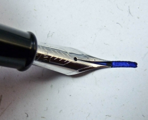
My pen came to me by way of Paris a few years ago. I was lucky that the original box and instruction insert were with it which shows it’s an early model after the change in ownership since on the lid are the words “Heretofore known as the Boston Safety Pen”. Does it get quainter than that? It fills with an eyedropper which is the simplest ink reservoir system for a fountain pen. You unscrew the section and squirt ink directly into the barrel with something similar to, well, an eyedropper. The nib is a small stub which has a nice, sharp feel to it.

A "Tempoint" nib.

The other noteworthy thing about the pen is that it came with a skull clip. The French seemed to keep using aftermarket clips longer than other places and I find this one to be especially interesting. I did a blog post about it a while ago here.

So, this is a rather unremarkable but strangely satisfying pen. An eyedropper is the fountain pen stripped to the core and it’s always good to go back to basics.

Wahl Tempoint writing sample.

Niblets

I’m finally getting back to writing about pens, a topic I find interesting even if that may indicate a psychological abnormality. A number of things have been sitting around waiting to be introduced here but without a common theme to link them. If pressed I can say all the pens do happen to have good points, and I mean that literally.

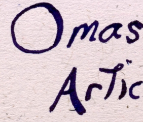
First up is something cool due to its obscurity. The doo-dad maker Levenger sells a lot of fountain pens and sometimes contracts with manufacturers to make special editions for them. Somewhere around 10 years ago they had the Italian firm Omas make a nice medium sized piston filling fountain pen called the Articula. Not a big deal in itself but the hook with this pen was that it had a flexible nib. Of course a modern flexible nib is only semi-flexible in comparison to those from the days of yore and this is no exception. Nonetheless the nib is comfy to use and can be coaxed into an expressive mood. I’m not sure why this wasn’t a more popular pen considering all this.

Nibs in a row: Sheaffer, Parker, and Omas.

It’s hard to find a Parker Vacumatic with a nib that isn’t narrow but they exist and I had such in the form of disembodied Canadian made stub. Never wanting such a nifty nib to go to waste I put it on a circa 1940 standard size Vac I had recently purchased as part of a lot. Even more frightening was this Frankenpen was already equipped with the wrong filling unit in the form of an earlier lock down version instead of the proper aluminum speedline. The result is actually not scary but a nice writing mish-mash with lots of character.

The final pen is a Sheaffer’s Thin Model also equipped with a stub. A damaged barrel on the original required a replacement which turned out to be green creating an overall effect is a bit like a classic Pelikan (one of my favorite color combinations.) The modest stub nib writes smoothly and like the Parker discussed previously isn’t something you see every day.

Pens and Pooper. Thanks to Hazel for the pen wrap underneath. (click for closeup)

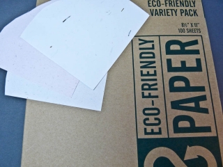
You have to have some paper to use a pen with and I got lucky enough to find something a few weeks ago both fun and environmentally sound. On a visit to Office Max I saw a few boxes of Terracycle recycled paper on closeout. What makes this cool is that we’re not talking paper made from post-consumer waste but made from some out of the ordinary items. The sample pack I have uses grass, banana peels and pachyderm excrement to make the sheets. Yes, you heard me: elephant poop.

All three papers are moderately rough in texture but very attractive with some unbleached elements appearing randomy. They are also very fountain pen friendly exhibiting no bleed or feathering. Sadly the reason I saw this was because it is no longer made and can’t be found at the chain anymore. However, if you search the web you will find other places that still market papers like this, even the poopy one.

And on that note I think it is a good time to end this post.

Soggy Pasta Primervera

If you’re active in using or collecting fountain pens eventually you will hear the term “flexible”. It’s often used with reverence as when someone gushes “the pen has a nib that is flexible!!” Sometimes you hear such called “wet noodles” which causes no end of confusion as people not familiar with the term try to figure out how long to boil their pen to get it al dente. I’m pretty sure that most people who read this (all 6 or you) will know what a flexible nib is and what it does but that isn’t going to stop me from rambling on and giving a explanation on a kindergarten level. If you are schooled in flex about you might want to skip to the pictures.

Once upon a time skilled individuals created fancy documents with flowing, beautiful script. If you look at historic letters you can see that the lines which make up the letterforms flow in varying widths. For example, a line descending into a curve would become broader in a natural swelling that reminds one of a widening river. The same line usually pinches back to being narrow yet again while it moves along into another letter. One could think of it a bit like brush strokes in painting where more pressure creates a greater ink patch on the paper. However, we are talking about pens and not bristly things.

Mechanically the way it was accomplished is very easy to understand (even for me). Writing tips from the quill to our modern gold nibs have a slit down the middle to the point which directs the ink through capillary action to where you want it on the paper. The narrowest line a nib can make is the width of the point without any (well, hardly any) downward pressure on it.  If you bear down while writing the two sides of the slit, called tines, spread apart creating a wider contact area on the paper. The more pressure means the wider the gap, and thus a wider line. Eventually if the spread is too far apart there would be a loss of capillary action or ink flow which stops the line on the paper which is bad. That’s how it works, Q.E.D.!

So, why is flex so special then? Well, fountain pens today are less able to create line variation. This is because the nibs are thicker and stiffer so the tines don’t move apart much. There’s metallurgy involved as well but I’m not getting into that since its complex and I’m too stupid to fully comprehend it. Let’s just say chances are a modern pen will usually write a predictable line without much variation akin to ballpoints.

As stated this is a change from the past. Early on just about all fountain pens (like their dip pen predecessors) had nibs that would allow for a great deal of flexibility. The systems used to teach cursive or business writing took this into consideration and instructed on when and where to apply pressure to create the standardized but artistic writing styles. Still, for writing in small print for things like accounting there was a need for uniform, thin lines and less flexible points were available. With the advent of things like flimsies and carbon copies stiff nibbed pens become the norm since a firm, regular contact point on the substrate was necessary. To top it all off an inflexible nib is easier and requires less practice to use correctly.

This transformation started in the 30s and by the 50s the vast majority of pens had fine or medium nibs often described as being like nails since their strength would allow them to be driven into wood with no damage. At this time flexible nibs were for specialty uses and not very common.

So, now that we know what a flexible nib is let’s take a look at some I have on hand. Below you’ll see a gallery of 5 nibs that have this quality (click on them for the big view):

Many people use terms like “full-flex” or “semi-flex” to describe a nib’s ability to create the mentioned line variation. There’s no standardized system to measure this and unless the nib is marked this kind of label is based on trial and experience. Luckily, three of the pictured nibs are marked so we know they are officially flexible. The first two are the rather rare beast known as the Sheaffer Snorkel flexisaurus. OK, I made that last word up but you get the idea. You could obtain a wide number of different points on Snorks (16 were listed but when you consider that there were 5 different nibs designs you can imagine the variety) and a number were flexible. Determining if you have such a nib is easy and 100% foolproof if the lightly etched nib codes (in use to 1958, after that you’re out of luck) are still visible. Often these have been polished off by the friction from repeated wiping. In the pictures you can these codes and the meaning is listed in the caption.

The Eversharp nib seen is stamped “flexible” leaving nary a doubt about what it was born as. Rounding these out is a Moore nib that through use can be determined as flexible and an Onoto with a stub nib and the moves to make it at least a semi-flex.

Now that you’ve seen the nibs you might want to see them in action. Well, too bad! I’ve got zero skill in calligraphy and my hand writing looks like I’m three sheets to the wind. OK, I did do something in the way of a demonstration which is that I doodled and recorded it. So below is my first (and maybe last) attempt at being my own A.V. club and I hope you enjoy it.

[media width=”[media width=”540″ link=” height=”350″ link=”http://www.youtube.com/watch?v=89Q_dHfeJew”]


If the video isn’t enough for you for an encore I’ve got some writing samples for you to examine followed by an image of what the whole pens (not just the nibs) look like.

In A Vacuum-Filler No One Can Hear You Scream

Has there ever been a filling system as maligned as the Vacuum-Fil?

Sure there have been! That doesn’t take away from the almost leper like treatment the Sheaffer Vacuum-fillers gets in comparison to lever fillers of the same era. This despite the fact it works very elegantly: On the down stroke a rod pushes a gasket forward which lowers the air pressure in the sealed barrel behind it. A sudden release of the vacuum causes ink to be drawn in to fill the void. There’s an excellent explanation at Richard Binder’s site for those who want in-depth knowledge of how this functions. It all sounds good but there are several meritorious reasons why people have a poor opinion of the system.

First off you’ll never buy an unrestored Vacuum-Fil in working condition. The system functioned well but was not designed to last over 50 years and be like new. The seals are wear points and the filling cycle exacts a lot of stress on them so they fail. No vacuum can be created then and thus no filling.  Another strike against Vacuum-Fillers is that they are very hard to restore and well beyond the average hobbyists’ ability to do so.

It’s not all down side and there are some very nice positives to balance (pun not intended) things. When working they hold a ton of ink so you can write that novel in one filling. Using them is fun since you get to hear the “pop” as the vacuum releases and then see the ink flow up into the pen. Most importantly is that Vacuum-Fillers usually sell for bargain prices even with the cost of restoration factored in.

P1050988-2 August 21, 2009 4
A Sheaffer Vacuum-Fil. (click images for close ups)

With that background out of the way let’s look at the Sheaffer Balance Vacuum-Fil I own. It’s was made in the late 30s and constructed of brown striped Radite (celluloid) plastic. There are a couple things that make this pen a bit odd. The barrel is almost totally clear instead of having the usual thin clear stripes between opaque ones. If you look closely you can see ghost like slightly browner strips but they are almost as clear as their neighbors. Was this a demonstrator pen? I really don’t know and some quick searches in reference books and on the web didn’t turn up any answers.

P1050971-8 August 21, 2009 2
The very clear barrel.

Another nice thing about this Balance is the crisp stub nib it has. Finding an oddball nib on a Sheaffer of this era is always fun. The majority of the pens from the Fort Madison firm in the 1930s always seem to have staid fine or medium points and I jump for joy seeing something like this.

P1050965-6 August 21, 2009 1
The stub nib.

Filling the pen, as stated, is fun but writing with it is more so. The nib has a little tooth but isn’t fussy to write with and has lovely line variation. It’s a stub you could live with on a daily basis since it never intrudes to tell you that you need to pay it special attention. Add this to the pen’s nice mid-sized frame and classic bullet shape and I’m certainly not going to disparage it. However, I know that it calls me a ridiculous pen kook behind my back.

P1060381-186 August 25, 2009 1
Writing sample of this pen. Click on image for close up.

Tippy Dippy Touchdown

20090521-sheaffertipdiplogo

I never liked the term “cheap and cheerful” since it always conjured up an image of someone who relished penny-pinching to me. But if any pen really deserved that moniker the Sheaffer Touchdown Cadet Tip-dip model does. Why? Let’s pop the pen out of its packaging and see.

The Cadet has a bit in common with an Esterbrook pen. First off, the nib is stainless steel and part of a threaded unit that screws into the section for easy replacement. Both those traits it has in common with the renowned low-priced Esterbrook line. But when you look for a lever to fill the pen and can’t find one the similarities end. Unscrewing and pulling up on the blind caps exposes the trademark metal tube of Sheaffer’s pneumatic touchdown filling system. The other feature, the “Tip-dip”, turns out to be a small recess in the feed under the nib where the ink channel is exposed. This was intended to allow the pen to fill with minimal dunking depth in ink.

My example of this fountain pen was a NOS blister packed version that had and extra nib thrown in which was, glory be, a stub. Nowhere on it does it say “cadet” but that’s what it has been called in the old catalogs. Like the more expensive Sheaffer pens a whole range of nibs were available for the tippys including flexible styles. As mentioned it is made of stainless steel but there is a nice amount of tipping material at the end.

Sheaffer stainless steel tip-dip nib.

How does this early 60’s low cost pen feel to write with? Great, I must say. The pen is substantial but light weight and the point is smooth with some line variation. Construction is exemplary with high quality plastics and metals. I’ve been inside the pen too and can report it is made just as well as the expensive touchdown models.

I would certainly recommend a vintage tip-dip pen to anyone looking for a practical and economical writer. It turned out that this inexpensive vintage pen is an attractive, solid writing instrument which is far more “cheerful” than “cheap”.

may-20-2009-1-blog-p1020997
Cadet writing sample.

Mystery Point/Counterpoint III

I promised to proffer my guess on the mystery nib affixed to the Tuckaway I talked about in the posts Mystery Point/Counterpoint and Mystery Point/Counterpoint II. I had an unfair advantage, though, in this since I have a few more Sheaffer catalogs than just the one I showed the page from already. Take a look at the page from few years later below. It’s still an illustration without too much detail but I think it shows the shapes a bit better. Considering that the point has quite rounded shoulders and the nib does not exhibit too much curving inwards at the top leads me to my guess that the nib in question is a flexible coarse. Of course we’ll probably never know the truth.

Sheaffer nibs for 1953.

Mystery Point/Counterpoint II

The post before last I described a Sheaffer nib that I couldn’t quite classify. It was a triumph nib with a wide point and some flexibility which wasn’t like anything I had seen before (not that I’ve seen very much). Well, I’ve come across some information that may help to figure this nib out a little.

Old manufacturer’s catalogs are an invaluable resource for vintage pen information. In the past you usually had to be lucky enough to find one at a flea market, buy a reproduction, or get it lent out to you. None of these options is acceptable for someone like me who needs instant gratification and has no patience. Luckily I stopped by Bill Acker’s site and saw that he is now selling PDF downloads of catalogs! I purchased four from Sheaffer right off the bat and one was for the year of the Tuckaway with mystery nib (1949). Take a look at the image below of the nib styles for that year.

1949 Sheaffer nibs courtesy Bill Acker. (click for larger image)

Surprising how many points types there were for triumph nibs in 1949, isn’t it? The one problem with this illustration is just that. A photograph would give more detail to go on when trying to match my nib with the ones on this page. I think we can narrow it down a bit now at least. Which one do you think it is?

Mystery Point/Counterpoint

It’s great when you have an indicator of what type of nib is on a vintage pen. Some Wahl examples had “flexible” stamped on them so it’s pretty clear what you’ve got. Sheaffer Snorkels had codes lightly etched on the base of their nibs corresponding to a certain point type. A feed may have numbers on it which could be decoded to give the same kind of information like on a Parker 75. If you’re really lucky you might have your hands on a pen that’s new old stock (never was sold) with a factory identification sticker or chalk mark relating the vitals about the type of line it will create.

Realistically the vast majority of vintage pens one can buy are bereft of any readable information. To know what kind of line that shiny gold thing at the end is going to put down you need to do a close inspection as well as use the pen. There’s no real standard about what makes a fine, medium, or bold point what they are. If you draw a very thin line with a fountain pen you say “fine point” and if it’s pretty thick you say “bold point.” Stub, italic, and music nibs can be seen to be what they are by usually by eye. Knowing when you come across a flexible nib is a combination of subjective considerations and experience. Many people mistakenly think a semi-flexible nib is full flex because they’ve just never used the latter.

Now that we know the confusion that can be had on the topic of nib grading and identification let us look at a prime example of “huh?” I have a Sheaffer Touchdown filling Tuckaway model which has a nib I can’t quite categorize. It was sold as a bold nib, but bold nibs usually have a pretty good spherical blob of tipping material on them. This one has a thin edge to it almost like a stub nib. So, is it a stub? Well, it has pretty rounded shoulders that make me question that. And to make matters a little more interesting it has some flex to it when used.

Closely inspecting the construction of the upper part of the nib in question (nib A) we see some more oddness. I’ve included a few images of both this nib and a contemporary medium-ish Sheaffer nib for comparison (nib B). As nib A approaches its point you can see that it becomes flattened which is shown well in the back and side view images below. Nib B maintains a lateral curvature in this same area before getting a little flatter closer to the tip. It’s this flatness that allows nib A to flex more than nib B which has stiffer tines due to that arch shape being carried through. Another difference is that the feed ends a bit lower on nib A so it won’t bump on the paper when the tines spread. Lastly, you can observe how wider tines give nib A the shovel like appearance at its end reminiscent of a stub nib.

Writing sample.
Writing sample.

So, I don’t know what this nib is really. I’ll call it a bold with some stub like qualities. Look at the images and writing sample and see if you can come up with the answer.

(Click on images below for full size)

Fixing Fil

filcap-sm

Even newer pens can quickly need some tender loving care. Recently some simple repair work came up on a pen that shouldn’t have needed it. It was purchased used but promised to be in working condition which, as you can guess, was not an accurate description. Still, I’m happy I did get to do this work since it’s an interesting pen with a bit of a story.

Several years ago Richard Binder, well known for his specialty nib work, and Filcao, a little known Italian pen manufacturer, collaborated on a design. Called “Columbia, the Gem of the Ocean” it is styled in the mold of a vintage writing instrument.  CTGOTO (I love acronyms) has solid, square shouldered good looks and a moderately large size which makes it comfortable to use. The luxury of a sterling silver cap band is a contrast to the humble steel Schmidt nib. But it is not a simple nib since Mr. Binder has in this case tweaked it to be a cursive italic. Orange flecked blue acrylic used for the barrel and cap is the finishing touch to this attractive ensemble.

Worth noting here is something not seen too often on modern pens: a button filler. With the original Duofold Parker put this filling method on the map as a way around patents like Sheaffer’s for the lever filler. It is novel, quaint, and best of all works easily in the following manner: A button under the blind cap at the end of the barrel is pushed down to start the process. This button rests on one end of a spring steel pressure bar and the other side is anchored in the niche between the sac nipple and the inside wall of the barrel. This unit will flex with the downward pressure compressing the sac that it sits next to. When the button is release the sac inflates which draws the ink into it.

When this pen came to me I was surprised to find that the rubber sac had hardened and broke. Usually you wouldn’t think that could happen on a pen this new, but it did. My guess is that the sac may have been old stock and had aged even before it was used. Either way, it was an inky mess inside when disassembled. To fix it all that was needed was a scrubbing and a new sac. A silicone sac was used since I like the fact they don’t degrade like rubber ones over time. Below are a few pictures of the process.

filpart-sm
Filcao dissasembled for repair. (Click for larger image with parts labeled)

This is the pen taken apart for the repair. Not really very many parts for this filling system.

fil-dis-sm
Button filler.

The pressure bar sits next to the sac like shown here. The button at the end forces it to flex.

Filcao pressure bar being inserted.

After section with sac screws into the barrel you insert the pressure bar from the other end until I seats near the section.

Filcao button end.

You can see the end of the bar peeking out. Next the button and retaining washer is screwed onto the end.

Button fill assembled.

Here is the barrel all done.

Filcao writing sample

Snorktastic Nibs

I have a weakness for Sheaffer Snorkels and I’ve already talked a bit about one in an earlier post. They were from that writing era between fountain pens with expressive nibs and the evil empire of the ball point pen. The precise lines of nail like fine and medium point pens were the hallmark of this period. Even if most people were happy with this dull situation Sheaffer still offered a wide variety of Snorkel nibs with flair. Those special order nibs, as well as some made in Canada, England, and Australia which catered to those markets less uniform tastes, offer a real treat for the collector today.

Determining if you have found an oddball nib is by the numbers. Well, actually numbers and letters since Snorkel nibs were marked on the front or back with a code. I’m not going to discuss Sheaffer’s elaborate numbering system for their Snorkel fountain pen nibs since places like PenHero.com have great articles on the subject. What I’m going to do here is show my interesting nibs so you can see a few examples and in later posts some will get a more thorough review.

In this picture: Australian bold flex, FF3 fine flex, FS2 stub flex, Australian bold triumph, SR4 right oblique triumph, s4 stub. (click for larger image)
In this picture: Australian bold flex, FF3 fine flex, FS2 stub flex, Australian bold triumph, SR4 right oblique triumph, s4 stub. (click on for larger image)

If you want to find one of these great nibs keeping your eyes open is the first rule. Not all of them have retained their grade markings since wiping, polishing, and just normal wear can remove them over time. If those codes are gone look for tell-tale signs such as the flat edge of a stub point or the lack of an impressed grove between the silver and gold on a two tone flex nib. In general they are the proverbial needle in the haystack so obtaining one comes down to luck or enough loot for a purchase from a vintage pen seller.

Here are a few larger images where the nib grade codes can be clearly seen:

Flexible Fine Nib.
Flexible fine nib.

This flexible fine nib captures some of the essence of the “wet noodles” from the early part of the 20th century.

Flexible stub nib.
Flexible stub nib.

Able to put down a line as bold as a thick Sharpie this flexible stub is quite amazing. This single-tone nib was the least expensive one Sheaffer sold in solid gold but was still offered in all the usual variations.

Oblique stub nib.
Oblique stub nib.

“Right Oblique Stub Point Palladium-Silver Triumph Nib” is a long moniker. The obliques are hard to use since the pen really needs to be held at the right angle.