The Irish, Tiny Dots, Ukuleles, and I

Please bear with me since I’m going to cover a lot of ground in this post. Really, if I wasn’t so lazy I’d make this into three different standalone posts instead of this omnibus one but I can justify running the subjects together since they do link up.

Think Ink

The seed of this post started as an ink review. I hate doing ink reviews since so many people do them better than I with the same inks and usually far earlier. Certainly I could do samples, test drying times, and talk about saturation but there’s no way I could spin it so it wasn’t repetitious. None-the-less I did get two free J. Herbin inks from the great Quo Vadis Blog St. Patrick’s day giveaway this year and I felt it only right that I make mention of them.

The inks were supposed to be some variant on orange and green (the colors of the Irish flag along with white) and so I had to sit down and decide which to ask for. The only green I don’t have from J. Herbin was the Diabolo Menthe and so that choice made itself. Orange provided a different challenge in that I already had the only one available: Orange Indien. Thinking out of the box I did see another ink that has a bit of orange undertones called Ambre de Birmanie. A few weeks later both inks arrived through the good auspices of Karen Doherty at Exaclair.

Without a real plan about how to review them I did do some writing samples with both inks to check them out. Recently I restored an interesting Conklin pencil and pen set which I decided to fill with one of the inks. Most people think of Wahl when metal fountain pens are mentioned since they advertised their line heavily in the early 1920s. However, other manufacturers made similar pens such as the rolled gold ones seen in the picture below. The checked design and proportions are reminiscent of the Wahls with the most noticeable differences being the domed ends and Conklin patent spring clip.

Conklin metal pen set.

After trying the pen with Ambre de Birmanie I was surprised by how much I liked the results. While not super saturated the pleasant color and nice line shading that was displayed is very pleasing. This test led to me noticing the Conklin’s #3 semi-flex nib showed some disturbing ink starvation. Over time I’ve happened across articles that mention that even the flexible old pens of yore were not meant to flex as wide or as long as a calligraphy pen, for example. Still there are some that can maintain a happy ink flow for a good long time. This pen didn’t do that.

Fussing With Flex

I can live with the Conklin’s ink flow since I think it just might be the way it is but it did make me think of another pen I had that was bedeviling me with similar problems. The history of this one is that a year or so ago I found on an old Sheaffer parts pen a nib that was actually flexible. After some trial and error I put together a pen from old parts to give this nib a new home. I called it “Frankenflex”. From the beginning I noticed there wasn’t enough flow and as the nib flexed the ink dried up. I put the project aside and almost forgot about it till I was looking for a pen to try the Diablo Menthe in and saw it laying there. Taking another crack at the pen and seeing if it really was as bad as I remember seemed like a good idea. As you can see from the second writing sample shown later in this post I did not imagine the flow problems. There are many areas where the line separates into two small tracks which are the two tines distanced from each other with no ink flow to fill the middle.

As for the Diablo Menthe ink I don’t quite like it. It’s very light and thin looking even when it shades darker which isn’t endearing. I’ll keep thinking of a good use for it, though, and maybe one the right color paper it will grow on me.

After filling the Frankenflex I decided to get back at trying to make it write correctly. Ink flow has a few different aspects to it including the amount of ink, the viscosity of the ink, and the way the surface tension is maintained. The mechanics behind those include the distance between feed and nib, the size of the ink/air channels, and the shape of the nib slit. There’s a lot more to it than those factors (some good information about this can be found here) but those I mentioned are ones a simple mind like mine can handle. Deciding that widening the channels on the feed was the way to go I went to work.

If you look at the first picture below you’ll see the parts of the pen that do the heavy lifting. On a Sheaffer of this era the feed (A) has a long half-round extension (B) which slides into a hole at the end (which you can see in the next picture). The ink travels up this feed extension into the middle of the feed proper where is gets to the underside of the nib through a slot cut into the topside. It’s a bit more complex than the usual feed you see in fountain pens of this era but still rather straightforward. My goal was to increase the width and depth of the feed channels and the width of the top feed slot. Hopefully by doing this I would increase the flow and supply the nib enough ink to keep it from drying out when flexed to make a thick line.


I used an X-acto knife and some fine sandpaper to attack the job with. Heeding the saying “easy does it” as a guide I only modified a little each time and then put the pen back together to test how it wrote. The third picture in he set above will show you what the feed looked like after I widened it a bit. A series of writing samples seen below show my progress (and frustrations) as I worked along. Test 2 looked like I was making progress and I was happy. However, it still needed improvement so I went back to make more adjustments. The third sample you see looks worse than the second one for no reason I could figure out. Fickle is the fountain pen and its ink feed mechanism! Confused but not beaten I took it all apart again and did more adjusting and widening. Finally we come to the last test and its satisfactory result. There is a lot of improvement in general and it was a nice point to stop before doing more damage than good. Yes, I’m very good at doing damage if not careful.


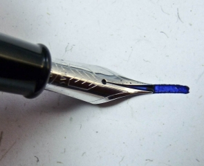
You may notice I used a different ink in each test and pose the question did that make a difference in flow? I do find that thin inks don’t seem to work as well in flexible pens as ones that are more syrupy. I’ve not done a controlled scientific-y test to see if this is correct and the fact that denser liquids have less capillary action would seem to contradict my observations so I just wind up confused as usual. The picture below shows the Frankenflex nib with the tines widely separated. Between them is a ribbon of ink that when it breaks stops in the ink from making a solid line. The goal of all this was to keep that ink flowing down the gap.

Frankenflex nib flexing.

Padding This Post

There is one more thing I really need to mention before finishing this all up: For the samples I used the new Rhodia Dot Pad which I recently purchased. It’s quickly become my favorite pad style due to the both the pattern and the paper. Rhodia pads always have great fountain pen friendly paper in them and this pad is no exception. The smooth 80g acid-free, pH neutral paper has purple dots in a grid on it which is both useful and discrete. I’m really sold on it.

You’ll also see a lovely roller blotter in the picture below that was purchased for me (I paid him for it, don’t worry) by Rodney, a grand person from the great state of Hawaii. It’s made of the native Koa wood by David Mozdren who runs The WoodJoint (808-294-3283 is the number but no website and I know nothing more of his work). The wood is beautiful and often used in the construction of musical instruments like Ukuleles.

J. Herbin inks, Frankenflex on left, Conklin on right, and Koa wood blotter.

Musical Finish

So, we come to the end of this rambling post with something I thought I’d never mention: Ukuleles. Maybe in the future I’ll fit Zithers or Theremins in somewhere.

Wahl Flower

The Wahl Company is still in business today. If you are a man and had a trimmer used on your hair at the barber you most likely experienced one of their products. Sadly, they do not make writing instruments anymore having sold that division to Parker in the 1950s.

A Wahl pen and friends.

Years before they were absorbed Wahl itself absorbed a firm to buttress their market leading Eversharp mechanical pencils. Boston Fountain Pen Company made good quality pens and had a few nifty patents for an inner cap and roller clip. They were always a bit short on capital, however, and Wahl knew a good thing when it saw it. After the purchase in 1917 the old Boston marked stock was used up and eventually Wahl started sticking its name on the barrels and nibs.

Wahl eyedropper pen.

So the Boston pen became the Wahl Tempoint pen. Tempoint rolls off your tongue and has a nice sound but the meaning is pretty nebulous. It’s said that it is supposed to mean “tempered point” to bring to mind flexibility and strength but in my head also conjures up the idea of “temporary point”. Anyway, the catalog of the time says the point is crafted with a special “hand hammering process” and the iridium is “fused” not “annealed” to the point for a longer life. I’m thinking if that’s the case I want to be annealed for my personal longevity.

Until the introduction of the Wahl Metal Pen these warmed over Boston pens were what was peddled. Still, they were on par with the best black hard rubber products of the time. In this post I’m showing off a simple chased BHR Tempoint eyedropper. In the 1919 catalog this model is called the “Ardmore” which may or may not be a model name. I say that since next to all the names in this book are the legend “Telegraph Word” which makes me think that these tags were used for orders via that method. One of the best things about the catalog other than the pregnant advertising prose is an illustration used a few times of a wing-collared businessman holding a pen the size of a baseball bat. It’s just superimposed over his hand and gives a certain surreal mood to the page.

Elephantitus of the pen.

My pen came to me by way of Paris a few years ago. I was lucky that the original box and instruction insert were with it which shows it’s an early model after the change in ownership since on the lid are the words “Heretofore known as the Boston Safety Pen”. Does it get quainter than that? It fills with an eyedropper which is the simplest ink reservoir system for a fountain pen. You unscrew the section and squirt ink directly into the barrel with something similar to, well, an eyedropper. The nib is a small stub which has a nice, sharp feel to it.

A "Tempoint" nib.

The other noteworthy thing about the pen is that it came with a skull clip. The French seemed to keep using aftermarket clips longer than other places and I find this one to be especially interesting. I did a blog post about it a while ago here.

So, this is a rather unremarkable but strangely satisfying pen. An eyedropper is the fountain pen stripped to the core and it’s always good to go back to basics.

Wahl Tempoint writing sample.

Wahl-E

I’ve been called a man out of his time. I’ve also been called “jerk face”, “loud mouth”, and “cheese baiter” but that’s neither here nor there (and I have no idea what the last one even means.) With my interests in things that are old and obsolete it’s no wonder I like the historic period that spans the gilded age through the roaring 20s. While my favorite watches were manufactured right around the turn of the century my favorite pens came into being over twenty years later.

The 1920s and 1930s are called the golden age of the fountain pen for good reason, some of the most beautiful pens ever made were created at that time. With colored hard rubber ushering out the age of the PBP (plain black pen) followed shortly after by the introduction of cellulose nitrate plastics fountain pens were now a fashion accessory. Also the teething pains of manufacture shown by awkward filling systems, strange patent feed designs, and clip on pocket clips were long in the past. Fountain pens wrote well, looked good, and didn’t leak all over your shirt pocket.

In the period between the reign of vulcanized rubber pens and the usurpers made of flammable plastic there was a time where you could get something utterly different than either material. I don’t mean the metal overlay designs had been around from the earliest days of internal reservoir pens as these were basically a hard rubber pen covered with a shell of decorative metal. While pretty they were structurally the same old pens with fancy wrappers.

Wahl Pen 2

Wahl, a company well known for its adding machines and Eversharp mechanical pencils, purchased the Boston Fountain Pen Company (or at least part of it) in 1917 so it could get a quick start in the business of making fountain pens. Wahl sold what was basically a slightly upgraded Boston hard rubber model for several years. Then something so big, so important, so game-changing happened that only the fine copywriters at Wahl’s ad agency could put this portentous event into words of the magnitude needed. I cannot improve on them so I will just reproduce them from the 1925 catalog here:

Wahl DiagramTHE WAHL PEN OF PRECIOUS METAL: A new landmark in fountain pen progress

Along the highway of fountain pen progress are but a few landmarks denoting basic developments in design that have guided the manufacturing effort of the future. The self-filling pen was one of these.

The self-filling pen, however, required a soft rubber ink sac which occupied a large part of the hard rubber barrel, and thus left little space for ink. Because the tradition of long years demanded that the barrel be made of hard rubber, the next step was simply to increase the size of the pen to get a larger space for the ink sac.

Thus resulted the bulky pens that have been the vogue for several years. But this method of getting greater ink capacity was a makeshift, as Wahl craftsmen realized. Why, they asked themselves, need the barrel be built of rubber at all, since the ink is contained in a soft rubber sac? Why not build the barrel of a thin strong material which would give greater ink capacity, plus added strength, without the disadvantage of cumbersome size and weight?

The answers to these questions resulted in the development of the Wahl Precious Metal Pen—a pen which we believe is destined to set up a new landmark on the highway of fountain pen progress. Gold and silver were the materials chosen to carry out this revolutionary conception of a fountain pen. New as these metals were to the art of fountain pen manufacture, they had been for many centuries the only accepted materials for the making of other high class articles of persona equipment. Since the beginning of civilization, they have been the only metals discovered (except for a few of prohibitive cost) that in their native state will maintain their outward beauty as long as any part of the material lasts.

So it was but natural that they were selected as the basic materials for The New Wahl Pen. This pen is so strong as to be practically unbreakable; it is slender and graceful, yet its ink capacity is greater than that of rubber pens twice its size; it is light in weight, perfectly balanced, unfaltering in writing performance, and has the rich beauty which can come only from fine jewelry designs engraved in gold or silver.

Some of the features are shown in the sectional view at the left. Note the thin walls, the rolled metal threads which cannot be broken, the large ink sac, the compact filling mechanism. Then turn to the pages which follow and note the beautiful jewelry designs and the graceful proportions of these pens.

Try a Wahl Pen from our stock; observe its fine balance, its light weight, and its certain performance. Compare its ink capacity, if you care to, with the largest pen in your case, and prove that it holds more ink than any other.

Wahl builds rubber pens, too, for those people who are not yet converted to this modern pen. These rubber pens are the finest that can be made, and second only to the pen of the future—the Wahl Precious Metal Pen.

Wahl Pen
A Wahl #5 Metal Pen

For those other than the luddites fighting the inevitably conversion Wahl metal pens were a very nice, if not quite earthshaking, writing instrument. They came in solid gold and sterling as well as silver and gold plate. It’s common to find the gold plated or “filled” models with a good deal of brassing from their long years of service. Dents and dings are seen more often than not since these pens are made of thin metal. If you find a nice example you’ll have a good writer with reliable lever filling and nice nibs which are sometimes flexible. Even the largest metal Wahls are compact and the smaller ones are extremely tiny. Some engraved patterns are worth more than other more common ones so you might want to check out this listing of them.

Wahl NIbThe Wahl pictured here is one of the bigger models they made. Usually you can tell the dimension of the pen by the how big the nib is as indicated by a number on it. The largest is said to be a #6 but those are very rare. A #5 like this one while not common will turn up for sale every once in a while.

Eventually Wahl stopped making all metal pens and switched to a line of plastic ones. I think the fragility of these dent collecting tubes helped speed that along. So ends the tale of a pen as important as the wheel, as much a marvel as electricity, as indispensable as the air we breathe: The Wahl Metal Pen.

Jiminy Clickit

This is a post about fountain pens that click. We’re all used to some ball pens, like Parker Jotters, having a button you push to click the writing point into place but there are not many fountain pens with this tactile fun. I happen to have two of them, one well known and the other not so.

Nibs peeking out. The Aurora on the left is a hooded nib which does not retract.

I’ll start with the famous Pilot/Namiki Capless/Vanishing Point. Wow, with that many different aliases it sounds like a fugitive pen. Anyway, with those monikers Pilot is trying to hammer into your head the fact that this pen has no cap and the nib retracts into the barrel. How does that work? It’s actually pretty simple.

There is a floating nib/feed/ink reservoir unit inside that pen which can travel fore and aft. A spring keeps it up in the retracted position where it rests when not in use. A push button on the back end gets…well…pushed driving the unit forward until it is locked in place by a ratchet mechanism. Another push and the lock is released allowing the pen to close up again. The important feature that keeps the ink from drying up is a small trap door at the point end which acts as a plug when the point is retracted. QED.

There have been numerous versions of the Vanishing Point (nee Capless) since it was introduced 1964. The currently produced models come in three variants that range in heft and size. The model I have is older and dates from the 80s. I like the faceted barrel, streamlined clip, and light weight of this Capless generation. The nib on it was reground into italic creating a very fun pen to write with. It’s easy to purchase these modified nibs of this type from folks like Richard Binder or Dannzeman.

Aurora 98 in box.

The other pen in this tale is not seen as often but certainly is almost as novel. The Aurora 98 replaced the famous model 88 in 1963 and was “period modern” with a more svelte design and a few gadgets. Think of it as the Italian Parker 51 with the additional pizazz its point of origin is known for.

One of the gadgets I referred to is why this pen fits into this post: the piston filling knob extends from and retracts into the barrel with a “click”. I can’t think of a very good reason for it operating in this manner unless people in the 60s had a tendency to accidently turn the pesky exposed knob at the end of some pens. Whatever Aurora’s thinking behind this the result is pen geek cool due to unnecessary complication.

The other peculiar contraption contained within this pen is known as “Riserva Magica” (magic reserve). When you are in the dread condition of having run out of ink with this pen you can, through use of a small supplied sparkly wand, squeeze a few more lines out. Yes, I am joking about the wand. Running the piston all the way down into the barrel (like prior to filling) pushes a few trapped drops of ink into the feed. Viola! You can write a bit more.

My 98 is almost NOS and is the attractive gold filled model. It writes a lot like a Parker 51 with a firm, fine nib. The hood has an odd flat bit over the nib’s centerline which I imagine was found to be pleasing by the designer. Other foibles include a slip on cap that really needs to travel a long way down before seating and tiny, tiny ink windows which make me squint when trying to appraise the remaining fluid.

So, that’s all the pens I have with clickability. Below are a couple comparison photos of them so you can see the chic click contrivances.

The More Things Change

Tibaldi Iride

The 1920s were the formative period for modern advertising with copy like “somewhere west of Laramie”, slogans like “the pause that refreshes”, and catchy Burma-Shave verse on sequential signs along roads to take advantage of the new mobility. The decade that followed is more exciting to me because it heralded the idea that if products were flashy and futuristic they would be easier to market. Parker didn’t let this slip by them and started a trend in fountain pens where the job done by a few simple parts was replaced by an amalgam of complexity.

Billed as being “like a pen from another world” the Parker Vacumatic was introduced in 1933 sporting a new filling system to replace the old button filler associated with their famous Duofolds. The filling system (usually also called Vacumatic) was a marvel of modern design. Instead of a bladder to hold the ink the barrel itself was a reservoir and even had clear sections to let you keep tabs on your ink supply. Some might complain that it really offered no functional benefit over existing lever and button fillers and they have a point. It actually requires more effort to fill a Vac then the single push or pull of the other systems. Also the pen as mentioned is complex and a lot harder to repair then the old standards. None-the-less this filling system was in use into the late 1940s on the Parker 51.

Let’s take a quick look how the filler works on these pens. The idea is that a rubber diaphragm is flexed up and down by a spring loaded plunger. When released the upward motion of the mechanism creates a vacuum in the barrel which draws ink up through a breather tube attached to the feed of the pen. The downward stroke pushes the air out of the pen hopefully not expelling as much ink as it sucked in. You need to do this 5 to 10 times to fill the pen so it’s a bit like winding a watch. The up side to your work is that the pen can hold quite a bit of ink.

After the Snorkel this is my favorite filling system mainly because I like crazy contraptions. I have a few Vacs and really wanted the Bexley owner’s club pen of a few years back because it actually used recycled filling systems salvaged from broken Vacumatics. However, I really never thought anyone would take the time and effort to design a new pen using this 70 year old filling principle. You probably guessed right away I was wrong.

Tibaldi was the name of an old, defunct Italian pen manufacturer. In the go-go premium pen environment near the end of the 20th century a company formed to resuscitate the brand (as was the trend) and designed a new range of writing instruments. Before this version of Tibaldi (the name has been reused yet again) went under they created a number of interesting and sought after pens. One of them is the beautiful Iride pictured here. This pen is made from red marbled celluloid and like pens of yore has transparent areas in the front of the barrel to let you see your ink. It also apes the Vacumatic in the odd decision to use the same filling system. Yes, it’s been redesigned with an integrated blind cap and a plunger larger in girth but it works the very same way and it holds a lot of ink.

Iride 2
Tibaldi Iride. If you click to expand this image and look closely you can see the barrel translucence.

I find it a bit of a mystery why Tibaldi emulated the very first Parker Vacumatic filling unit and not the later ones. Those early “lock-down” units had the pen’s owner retract the plunger into the pen and twist it to lock. The downside is that this last push makes some ink comes out of the pen meaning some lost capacity and that you’d better have it over the ink bottle. Parker introduced the improved “speedline” filler a few years into production, which stayed in the extended position when not being used.

No matter what the Iride is a gorgeous pen with red islands floating in the barrel glinting back at you when the light hits them. I like the simple monochrome nib and the fact the section is of the same material as the barrel. It works and writes well and is really reminiscent of an older pen.

Just to illustrate the similarities between my Iride and an early Vacumatic filler I’ve take some side-by-side images. Both plungers store in the down position via a detent on the Vac and threads on the Tibaldi.

When Tibaldi went out of business a lot of pens were assembled from left over parts and sold. Mine is one of those and I was lucky to find it. The rubber diaphragm in these fillers eventually wears out in time and I hope there’s a lot of life left in my Iride since it’ll be rather hard to find a replacement.

I’m So Blue

It is good that Sheaffer Snorkels came in colors. I find just having the choice of a pen in one hue to be rather boringly monochromatic. In the wacky world of collecting there are always some items that stand out in rarity due to such things as size, material, pattern and other differentiating characteristics. With Snorkels color is an important variable (along with nib type and build material) in determining value.

There are two separate periods when Sheaffer messed with color choices for these pens. The early pocket pens were made in what I’ll call (not that it’s unique to me) the “pastel” colors. These were Black, Pastel Blue, Pastel Green, Burgundy, and Pastel Grey. All pleasant colors but as 1956 dawned the U.S. was awash with fancy named choices for the finishes on the cars, appliances, and furniture people wanted. When a Cadillac could be had in bahama blue why not your pen? It was with thinking like that a new range of crazy colors was added to the Snorkel lineup: Fiesta Red, Vermilion, Mandarin Orange, Sage Green, Fern Green, Peacock Blue, Periwinkle Blue, and Buckskin Tan.

I’ve got most of the colors above and keep my eyes peeled for when rarer examples like Mandarin Orange appear. Another one that’s hard to get one’s hands on is Peacock Blue. The problem is that pictures of blue Snorkels tend be hard to interpret as pastel blue and peacock blue could look alike depending on exposure, lighting, camera quality, etc. I’ve seen many a pen for sale that looked “Peacocky” and just turned out to be over exposed. In order to help the two or maybe even three people who care about this I will provide the number of a good therapist. Actually, I’ll just show a photo I took of two side by side so you can see the difference. It probably won’t help too much but you never know.

Paste Blue set on the left and to the right is a Peacock Blue set.

Niblets

I’m finally getting back to writing about pens, a topic I find interesting even if that may indicate a psychological abnormality. A number of things have been sitting around waiting to be introduced here but without a common theme to link them. If pressed I can say all the pens do happen to have good points, and I mean that literally.

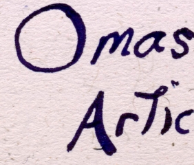
First up is something cool due to its obscurity. The doo-dad maker Levenger sells a lot of fountain pens and sometimes contracts with manufacturers to make special editions for them. Somewhere around 10 years ago they had the Italian firm Omas make a nice medium sized piston filling fountain pen called the Articula. Not a big deal in itself but the hook with this pen was that it had a flexible nib. Of course a modern flexible nib is only semi-flexible in comparison to those from the days of yore and this is no exception. Nonetheless the nib is comfy to use and can be coaxed into an expressive mood. I’m not sure why this wasn’t a more popular pen considering all this.

Nibs in a row: Sheaffer, Parker, and Omas.

It’s hard to find a Parker Vacumatic with a nib that isn’t narrow but they exist and I had such in the form of disembodied Canadian made stub. Never wanting such a nifty nib to go to waste I put it on a circa 1940 standard size Vac I had recently purchased as part of a lot. Even more frightening was this Frankenpen was already equipped with the wrong filling unit in the form of an earlier lock down version instead of the proper aluminum speedline. The result is actually not scary but a nice writing mish-mash with lots of character.

The final pen is a Sheaffer’s Thin Model also equipped with a stub. A damaged barrel on the original required a replacement which turned out to be green creating an overall effect is a bit like a classic Pelikan (one of my favorite color combinations.) The modest stub nib writes smoothly and like the Parker discussed previously isn’t something you see every day.

Pens and Pooper. Thanks to Hazel for the pen wrap underneath. (click for closeup)

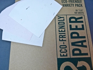
You have to have some paper to use a pen with and I got lucky enough to find something a few weeks ago both fun and environmentally sound. On a visit to Office Max I saw a few boxes of Terracycle recycled paper on closeout. What makes this cool is that we’re not talking paper made from post-consumer waste but made from some out of the ordinary items. The sample pack I have uses grass, banana peels and pachyderm excrement to make the sheets. Yes, you heard me: elephant poop.

All three papers are moderately rough in texture but very attractive with some unbleached elements appearing randomy. They are also very fountain pen friendly exhibiting no bleed or feathering. Sadly the reason I saw this was because it is no longer made and can’t be found at the chain anymore. However, if you search the web you will find other places that still market papers like this, even the poopy one.

And on that note I think it is a good time to end this post.

Gigantic Ink Giveaway!!

Well, it’s not that big. In fact it’s only one bottle but if you get really close it looks quite large. In celebration (well, in something) of my second consecutive mention in the (5th) Carnival of Pen, Paper, and Pencil, hosted this time by Goldspot pens, I’m playing Santa and offering up some Montblanc Racing Green ink. I’ve heard the folks at the white snow-cap brand are discontinuing this ink so I grabbed a bottle on my trip to Art Brown in NYC. Now it’s your chance to own it (minus a tiny little bit I used for the sample).

Ink Giveaway: MB Racing Green

The rules:

Post a comment telling me your favorite brand and color of ink below. In one week on 12/15/09  at 2pm EST I will use a random number generator and pick a winner. It’s that easy! I’ll contact the person via their email address with the happy news. I’ll ship this international too! Just keep in mind how slow the mail is to some countries, please. Oh, pen in picture is not included, nor is the pad for that matter.

Since literally tens of people read this blog your chances are pretty dang good! Get on it and I wish you luck!

The Pentom of the Opera

A hasty trip by air and auto took me away last weekend. By my standards having a little over a week to plan a trip is hasty, especially if you are going to New York City. Two things presented themselves to make me consider such a trek: A father who seemed to be feeling better than ever and his new car.

My father has had a few years of ill health (and all the baggage being a wee bit of a hypochondriac can add to that) so when some medical tweaks suddenly made him regain some vigor I was impressed. Since my father is at his craziest when in high spirits his purchase of a Porsche was only modestly shocking. Certainly at his age he should do whatever makes him happy and I’m all for indiscriminate spending on fun things, after all look what I collect! These events were a sign that it was time to get my father out and about doing something fun and far away after such a long period of him protesting he couldn’t.

Even though the weekend after Thanksgiving was very close the free from work Friday made the time ideal for this road trip and I went about quickly (OK, I procrastinated) making plans for it. Soon I found myself flying into Buffalo, NY and taking the wheel to move on down the road for 7 hours into the heart of Manhattan. It wasn’t all bliss, though. The expensive SUV didn’t have an iPod aux jack even though the cheapest Kia comes with such gratis. A few hours of driving and I was looking (and looking and looking) for a decent book on CD at Cracker Barrel to fill time on the boring concrete ribbon of the interstate. Learning to use the complex interface for the rather misguided navigation system also tried my patience. It worked like the partially decommissioned HAL did in near the end of 2001 a space odyssey and I was surprised it didn’t start singing “Daisy” somewhere in New Jersey.

Miraculously we made it to our Midtown hotel only to find our room was not ready yet. Actually, It wasn’t ready for two hours which normally would have perturbed me if it wasn’t for the fact that I got comped free stuff every time I went to the desk to ask “ready yet?” In the end through judicious choice of a different receptionist every time I went up to put forth my inquiry I had accumulated 10 free breakfasts and 4 slips for drinks at the bar. That was 4 more breakfasts than we needed for our 3 day stay but they started being distributed en masse towards the end of my pilgrimage to bug them.

The goals for the weekend fell into two general categories: Things with my father and things without my father. The latter was intended to help me keep my sanity over this period. The former included eating and the opera which was the point for coming to the city and we certainly had a good deal of both.

The Opera was Il Trittico by Giacomo Puccini and I was astounded by the stage presentation and voices presented by the Metropolitan Opera. It was long but that was justified by the final of the three single act operas called Gianni Schicchi. This was a very funny comic opera that won the heart of this most ambivalent opera listener. My father loved it all and even made a friend in an old woman who I found him discussing Czechoslovakia with when I returned from intermission. Below are some images of the event for you to take a gander at. The sets and stagecraft utilized for this were incredible and even utilized some tricks of perception to make the stage seem deeper than in actuality. Yes, I did put a tie on for the event which I felt was appropriate even if I’m not sure I didn’t look a bit like a tourist.

My father is a fine person but he has weird outbursts of angry old man at times. I’m pretty good at putting my hand over his mouth when this happens but my biggest challenge was to keep him from getting into trouble. In the end I am happy to say only 4 times did I cringe in either embarrassment or shock. At the opera he grumped at someone who got in front of him in the elevator which is par for the course. After the performance when cabs were scarce he wanted me to take proactive physical action to obtain a cab before others who had seniority. I will say here that he has some trouble walking and didn’t like standing around but I have two strikes against me in cab warfare: I’m polite and I’m rather small. Lastly, there was his outburst at a hostess at a German restaurant we ate at and how his inexplicable insertion of his hand in another person’s waiting food. I’m not even going to give details about that little incident.

Around all the other activities I did get to eat (and eat). One of my favorite restaurants is Les Halles whose executive chef once was Antony Bourdain. I go there for the boudin noir which in English has the less romantic name of blood sausage. Certainly not something you’ll find at the local IHOP but totally tasty if you can get beyond the ingredient in its name. Some giant German sausages at the Heidelberg, a prickly pear margarita at Dos Caminos, and some great Belgian beer at the BXL CafĂ© got worked into the trip as well. However, the only pictures of my general wanderings are of the environs of Rockefeller center. It was lovely as usual and the big tree was…well…big.

So, that takes care of the boring part of this all. Now I can talk about one of my favorite topics: pens and friends. I made a beeline Saturday morning for Art Brown International Pen Store which is a great place if you are of the pen, stationary, and ink mindset. An enjoyable time for me is wandering and ogling the contents of such a place, as you can imagine. I was picking up a few presents and some other items when I came across bottles of the now discontinued Montblanc Racing Green ink. I bought a bottle since it was low priced and now seemingly rare. I’m only mentioning this since I think I’m going to give it away on this blog in the near future.

Sunday saw me off on my own to visit MOMA. I wanted to see the Tim Burton art exhibit being shown but found after getting my tickets that you were assigned to a time slot when they would let you see it. Of course that time was 3 or so hours later than the when I arrived so I never got to view it. Still, all was not lost as I got to see a really fabulous exhibit on the Bauhaus school in prewar Germany.

After my fill of Deutsch modernism I had a terrific lunch with Dominique James, a pen friend. He is one of the original members of the Fountain Pen Network-Philippines group which I’ve blogged about before. Since I’m a distant acquaintance of a couple FPN-P members I’ve known that he lived in NYC and thought I’d see if he might want to meet up. I’m always stunned that someone would be nice enough to spend their valuable time with me but he agreed. The lunch was very enjoyable with much talk about pens interspersed with some interesting information on the Philippines and cooking. I stayed longer than anticipated so I was off in a rush to my next appointment.

Two people willing to see me in one day doesn’t come along too often so I hustled uptown to the Columbia University area. There another wonderful person who I knew from online interaction, but never met in person, waited. I, of course, was quite late to meet her and which got me off on the “now you look like a dimwit” foot. Mia was far nicer than I had a right to expect and my tardiness was overlooked. I got a highly enjoyable tour of the local neighborhood and a few places of sustenance. Food makes me docile and easily led so it was a good thing that I had great crepes for a pre-dinner snack followed by some wonderful croissants from a local French bakery. After the tour and picture taking I had an experience which reminded me of being on a childhood play date with a friend. We spread out pens, pads, and inks and spend time trying it all out. It ended way too soon as I had to go to dinner with my father who had spent a great deal of time watching football that day (yes, that’s my father). I left taking with me the two best tamales I ever had.

While on that neighborhood walking tour I did get to see a fascinating Church and fountain. The Cathedral of St. John the Divine is very imposing and creepily gothic. In the gardens next to it is both the oddest and most interesting fountains I’ve ever seen. The Peace Fountain has a depiction of the battle of good and evil which contains (among other things) a giant crab, the sun, and an Angel. Not sure how to fathom what kind of aquatic/solar/heavenly battle is going on but it’s dramatic. Even more surprising was the albino peacock that wandered behind a fence on the grounds. That was the last thing I expected to see in New York City.

I think both my father and myself had a great trip to that little, sparsely populated island city. I’m hoping to get back again at least to check out more stationary stores and maybe catch another opera to try and stay awake during.

Pen, Paper, Ink, Pugless

The idea that effort can be saved by gathering tasks together to tackle as a single unit is not something that originated with me. Being both lazy and a procrastinator I find myself afloat in a sea of topics and items I wanted to write about but never got around to. Thus I’m applying that principle here in this stitched together post that I hope will intertwine some ink, paper, and pen items sitting around here.

Pen

I single-mindedly comb the world for Sheaffer Snorkels with interesting nibs. My day races by with me obsessively hunched over a monitor, a phone in my hand, utilizing a chip in my cerebral cortex that gives me a direct uplink to the Internet. OK, most of that isn’t true but I do look more often than the average person to see if I can find something cool.

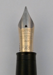
A little while ago I got lucky and found myself a pretty good deal on a Sheaffer Snorkel with a traditional open nib. Not a run-of-the-mill example this had the FM3 marked nib (medium point flexible). These are hard to find (proverbial hens teeth, needle in a haystack, or bit of food a pug won’t eat rare) and when I was the happy owner the bill came to an astounding $22. Lucky? No…it was skill! OK, I got lucky. I thought I was the Baron of Penfindia until a friend found something similar for $11. Descent from smugness is sometimes so rapid you skin your knees.

What is odd is that this nib has less flex and a slightly narrower line than the other FM3 nib I have. It’s still flexible but not as giving as the predecessor nib in my collection. I have a feeling these specialty nibs were more handwork than the vast quantities of fine and medium nibs turned out by Sheaffer and that might explain such variances. Once I did get this pen restored I filled it with Private Reserve Supershow Blue ink and happily doodled away on the next topic of this post.

The $22 flexible Snorkel.

Paper

Once again Karen at Exaclair was nice enough to send me a few things to give my hasty and subjective opinions on. One of them was a pad of G. Lalo Vergé de France white paper. I’m used to using the smooth Clairefontaine paper when I need something to make ink form shapes on so this was a nice change. This is laid paper and the factors you immediately notice with this substrate (otherwise known as fancy-schmancy stationary) is it has visible watermarks, a bit of a tooth, and a substantial heft.

What is laid paper? Well, making paper is a lot more complex than most people think. It’s not just like you chop down a tree or mash up some recycling and you have a sheet of the white stuff. There are a number of steps that takes the raw materials through slurry, gets it flat, and then smoothes and dries it. The end product differs depending on the way these procedures are done. The part that we need to look at involves what is called a screen which is for capturing the pulp slurry creating a thin skin and allowing water to drain out of it. As the fibers rest they take on any pattern that is held in the screen like a watermark, for example. Most modern paper is made on a screen of a fine mesh of filaments and imparts a uniform, opaque look to the paper (except for the aforementioned water marks). Laid paper is a more old fashioned method where the screen is made of parallel filaments and the final product shows a ribbed texture when light passes through it.

I like laid finish quite a bit and in fact the boarder around this blog is my scan of some Crane laid note sheets I had on hand. The pattern in the fiber seems to enhance the paper’s attractiveness because it creates visual interest.  Writing on this paper is a different experience from my typical papers since while not extremely rough you do feel the nibs contact on the sheet more. The act of writing somehow feels more formal and special. When I use it I feel all my words are profound and meaningful even though in reality they are incoherent scribbles that I don’t understand a few hours hence.

Specifically the Vergé paper is excellent in all areas. It’s 100gsm with 25% cotton fiber content so isn’t lightweight and shows almost no feathering. At first I thought there was bleed through on the paper but I quickly realized that these sheets are quite translucent and it what was written on the sheets could be seen as light passed through. When placed face down on a table it was less noticeable. That’s not a problem for me and since there are a number of available colors it might not be the case with those. Click on the images below for further enlightenment (or just boredom).

Ink

Along with the paper came ink I’ve been wanting to try for a long time. I like black inks but I hate ones that aren’t dark, dark, dark. Also some seem to have a reddish-brown cast on the edges that I really don’t like. I certainly have not tried every black out there but there have been a few on my desk over the years. Knowing that some of the J. Herbin colors aren’t too saturated I wondered how the Perle Noire that arrived would perform. Happily I can report that it is a nice opaque dark black that I’ve not noticed any negatives to yet. There are a lot of black ink comparison reviews in blogland that are quite thorough so I’d recommend taking a look since this is just a quick impression.

Pugless

So we come to the end of my omnibus post. There’s a still a lot of items I need to get to but at least I’ve removed a few from my list. The pugs wonder why they aren’t pictured in this post due to the growing number of fans they seem to have. Maybe next time I’ll see what input they might have but for now the puga donnas will just have to keep snoring.

OK, I gave in. Here’s Mr. Puggy’s reaction to the Snorkel. He tells me it’s beneath his notice.

P1090825-1 November 24, 2009 1